The Future Still Needs the Gimbels Skybridge

July 1st, 2022

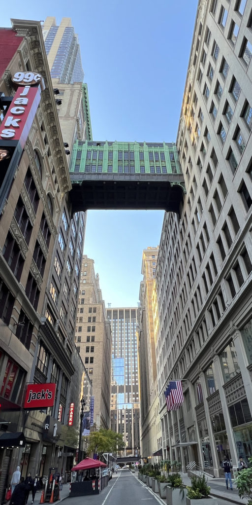
For nearly a century, the Gimbels skybridge has served as a kind of gatehouse announcing Pennsylvania Station on the next block west. Few would guess that its interior was once continuous with the station’s. The bridge will disappear if plans for the Empire Station Complex proceed. This would be a terrible loss. It is by far the most prominent aerial bridge from an era when the rest of the world looked to New York as the skyscraping, multi-level City of the Future—the crowning example of a phenomenon that influenced modern architecture and still captivates and inspires.

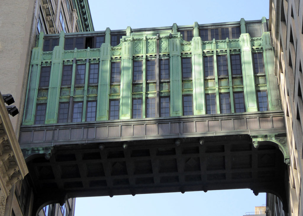
According to a 2014 New York Times piece by Christopher Gray, the bridge was built in 1926 when the Gimbels department store acquired the Cuyler Building across West 32nd Street and hired Shreve & Lamb—soon to be Shreve, Lamb & Harmon, and architects of the nearby Empire State Building—to connect offices in the building to the main store. Gray wrote, “The architects’ design was a no-holds-barred exemplar of the pedestrian bridge, a triplex skywalk with broad windows and magnificent copper cladding.”

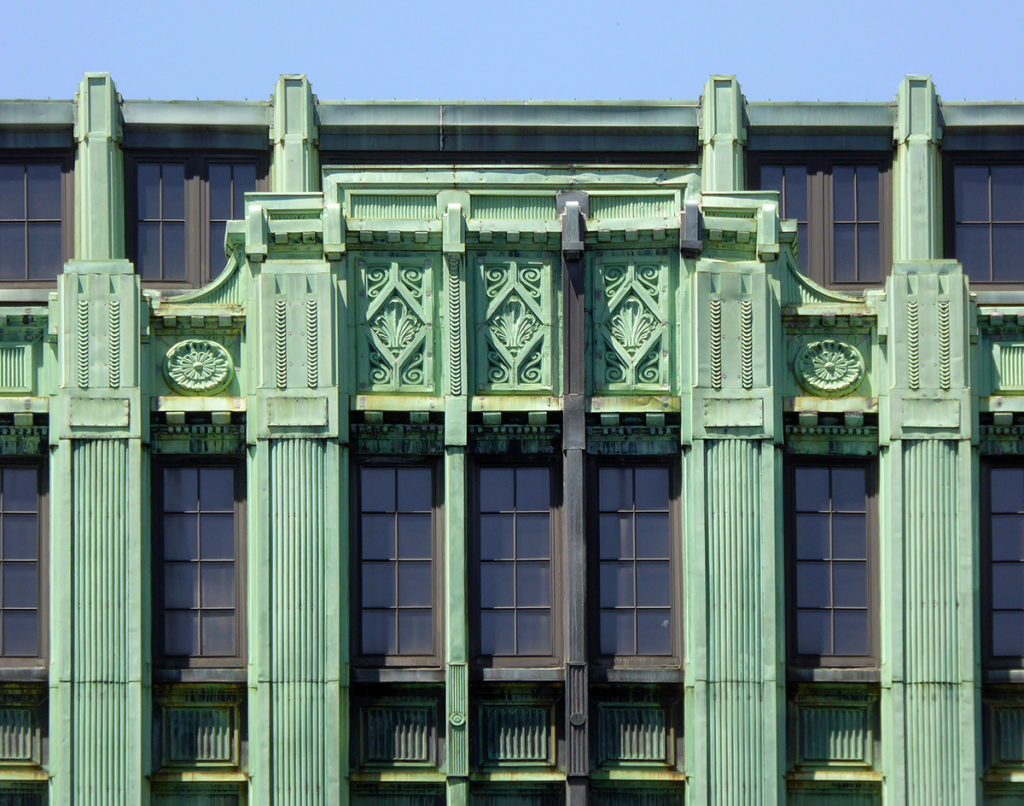
Gray observed that, “Although there is classical ornament, such as pilasters and coffers, the flat, machinelike character of the material suggests Art Deco, then barely emergent in the United States.” He noted that in 1982 The New Yorker called the bridge “the Chartres of aerial tunnelry.”  

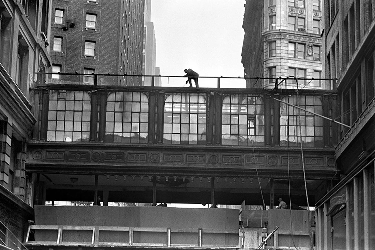
A 1924 skybridge across 33rd Street, also by Shreve & Lamb, linked the other side of Gimbels to the former Saks store. (It is shown being demolished in 1966.) When Saks moved to its Fifth Avenue location in 1922, Gimbels took over the old building, operating it as Saks-34th Street. The tamely classical Gimbels-Saks bridge shows how far its architects’ style stepped into the future by the time of the Gimbels-annex bridge two years later.

The two Gimbels bridges were part of a layered transportation arrangement for which New York was world famous. The streets beneath these bridges passed in turn over the subway, accessible through the Gimbels store. A pedestrian tunnel also connected Gimbels to Pennsylvania Station, passing beneath the Hotel Pennsylvania and Seventh Avenue. One could have entered this enclosed system through Gimbels, its annex, or Saks-34th Street and next stepped outdoors in Chicago, having accessed Penn Station through the connecting bridge-tunnel-building network.

The Hotel Pennsylvania and the Governor Clinton (now Stewart) Hotel were also part of this network, linked to the station by tunnels under Seventh Avenue. An out-of-towner could arrive by train at Penn station, get a haircut in its barber shop, buy underwear in Gimbels’ bargain basement and a suit at Saks, wear them to dinner in a station or hotel restaurant, listen to a big band in the Hotel Pennsylvania’s Café Rouge, sleep in one of the hotels’ thousands of beds, breakfast in the station’s cafeteria, and return home—without ever stepping outdoors. The linked buildings provided enough services to amount to a city within a city. Like their contemporary mixed-use complex at Grand Central Terminal, they anticipated the megastructure movement of the 1960s and 70s which melded buildings to transportation and aspired to place the full range of urban functions under one roof. In his 1976 book, Megastructure: Urban Futures of the Recent Past, Reyner Banham wrote that “patriotic Gothamites eager to claim the concept as a New York invention” could point to Penn Station, Grand Central, and Rockefeller Center. The movement had peaked by the time of his writing but it moved architecture’s needle. It’s ideas still guide leading architectural theorists like Rem Koolhaas and Steven Holl.  

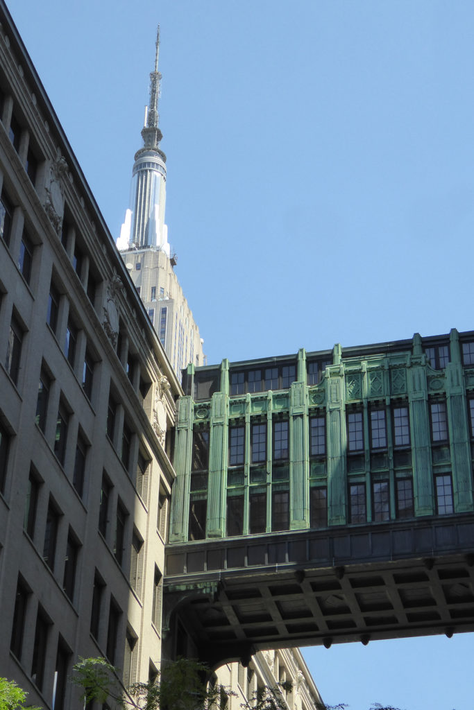
Shreve, Lamb & Harmon’s Art Deco Empire State Building is seen beyond their proto-Deco Gimbels skybridge which Christopher Gray called “one of the city’s great works of metal.” Both were designed in the late 1920s, a mythic period of concentrated activity when the exuberance of New York architecture reached a crescendo and many of the city’s best-loved and most defining works were produced. Both structures were the apotheosis of their type, the aerial bridge and skyscraper, which in combination dominated early-twentieth-century visions of cities to come. When Kuala Lumpur’s 1998 Petronas Towers followed in the Empire State Building’s footsteps as the world’s tallest buildings, their linking skybridge carried the DNA of this imagery.

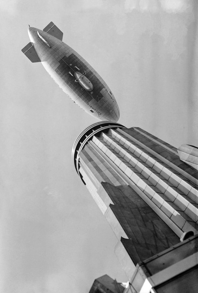
The Empire State Building’s top, another of the city’s great works of metal, was touted as a mooring mast for zeppelins. Impractical for this use, its real purpose was to contribute to the building’s record-setting height. The mooring-mast claim was telling, though. The skies of urban fantasies inspired by New York were alive with airships. It’s as if the Empire State Building’s designers felt obliged to deliver. Like skybridges and skyscrapers, lighter-than-air vehicles resisted gravity. These ingredients mixed to create popular urban visions that promised liberation from an earthbound existence.

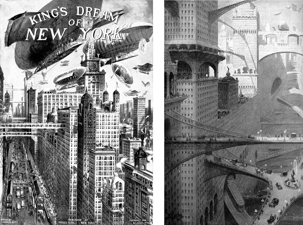
Images like Harry M. Pettit’s rendering for Moses King’s guidebook, Views of New York, and William Robinson Leigh’s painting, “Visionary City,” both from 1908, exaggerated New York’s towers and aerial pathways to project the future. Practicality aside, these cityscapes looked thrilling to inhabit. Aerial bridges allow people to magically step through building façades and cross streets in the air. Space takes on dizzying visual depth and unprecedented three-dimensional navigability. All of this plays to our fundamental condition as mobile bodies in space possessed of free will. The immersive motion in these images coincided with the advent of popular movies which also appealed to the modern appetite for speed, daring, and excitement.

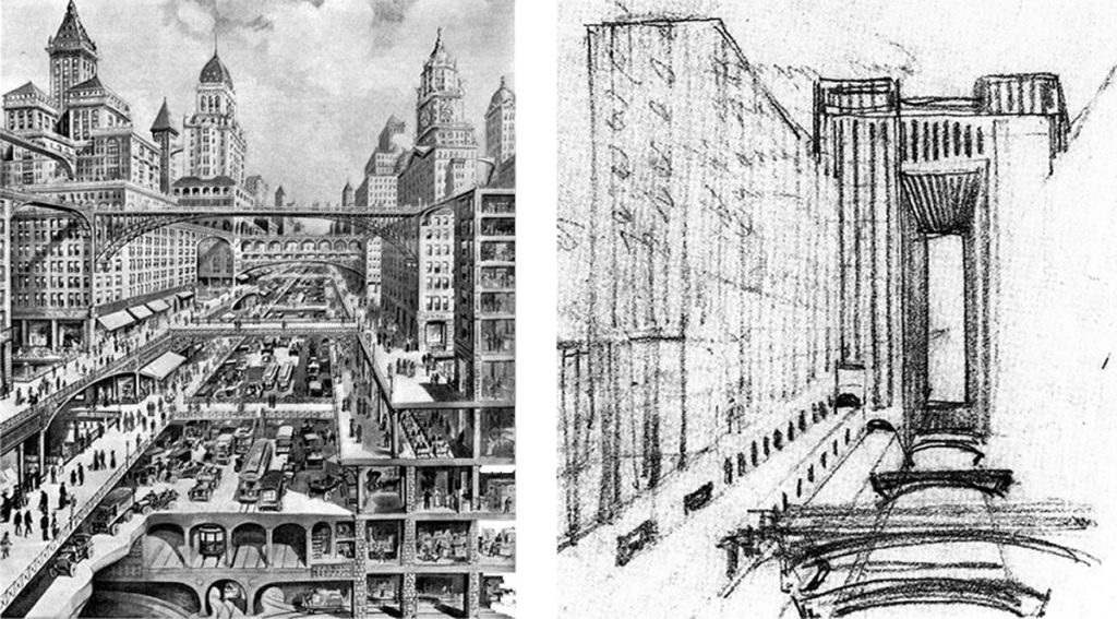
The illustration at left was featured on the cover of Scientific American in 1913 and reproduced the same year as “The Circulation of the Future and the Cloudscrapers of New York” in the Milanese magazine L’Illustrazione Italiana. Such images inspired the influential Milan-based Italian Futurist movement, as seen in Antonio Sant’Elia’s study for his project La Città Nuova (The New City) at right.

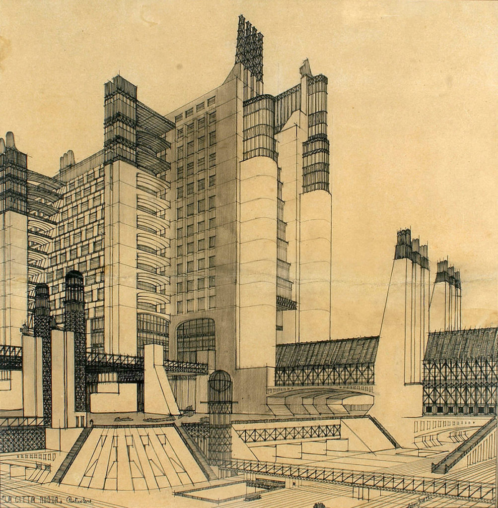
This 1914 rendering is Sant’Elia’s most fully developed rendering of La Città Nuova. (He was killed two years later in World War One at just 28.) Bridges, overpasses, and transportation systems aren’t tacked onto the static buildings of a traditional city, but used as the building blocks of a new kind of dynamic, city-scale structure that jettisons architectural history.

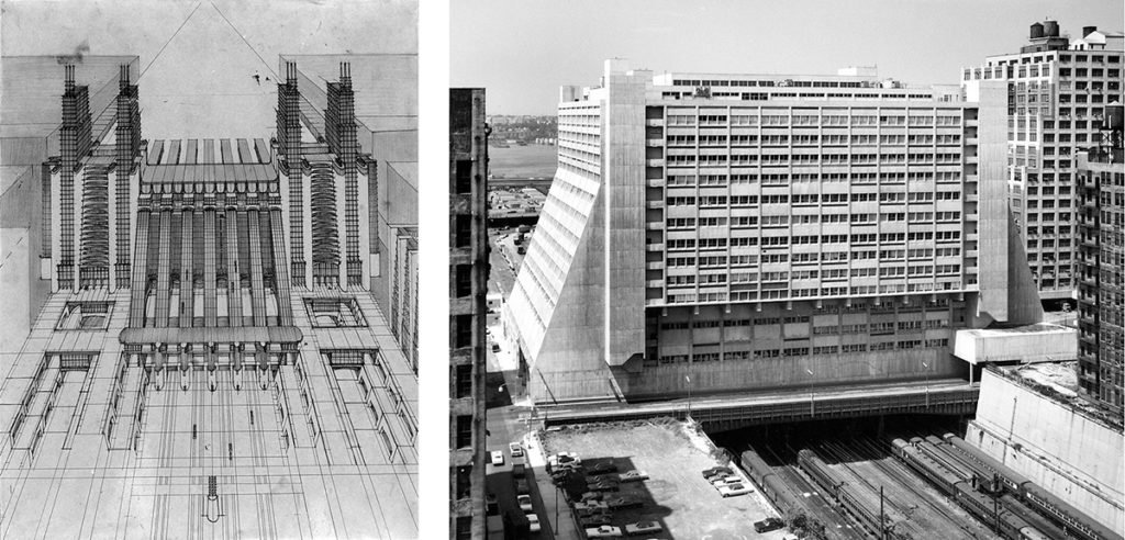
In the 1914 image at left, Sant’Elia imagined a station for airplanes and trains with funiculars. Manhattan’s Westyard Distribution Center at right was designed by Davis Brody and opened in 1969—one of countless buildings around the world influenced by Sant’Elia’s unbuilt body of work. The historic photo shows Westyard straddling the West Side Rail Yards. It has been renovated as Five Manhattan West. The block of the railyard beyond it has been decked over and developed as Hudson Yards. The block in the foreground has been decked over and developed as part of Midtown West, with a central pedestrian mall running from Five Manhattan West to Ninth Avenue directly opposite the west entrance of the new Moynihan Train Hall. The mall’s axis resumes on the other side of Moynihan Train Hall and Penn Station as 32nd Street, passing directly under the Gimbels skybridge like a through-line of architectural history.

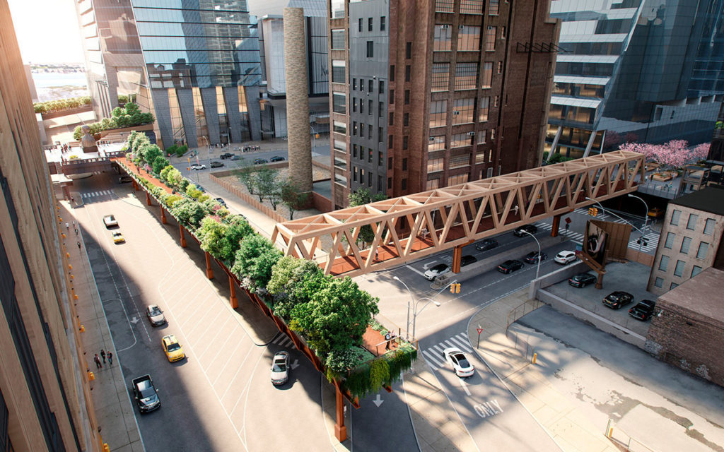
Five Manhattan West, formerly Westyard, is seen with its newly enhanced dynamic diagonals at upper right in this rendering of the High Line’s planned Moynihan Connector. The pedestrian bridge will link a tree-covered extension of the High Line’s spur to the new Manhattan West mall (a right turn just past the pink-flowering trees) which approaches the Train Hall. Another connector will link the north leg of the High Line to the west terrace of the Javits Center and a long-planned but never-built pedestrian bridge over the West Side Highway to Hudson River Park. Together with the High Line itself, this pedestrian network, raised above street traffic, may be one of the closest things ever built to those layered-city magazine fantasies that inspired Sant’Elia and the Futurists.

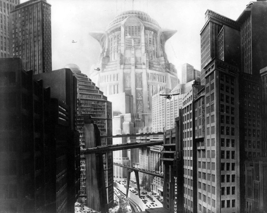
Fritz Lang said his classic 1927 film Metropolis was inspired by a 1924 visit to New York. It was also clearly influenced by futuristic visions of New York and Sant’Elia’s projects, as have been science fiction movies from Blade Runner to Brazil to The Fifth Element, the latter featuring a future New York dense with skybridges and flying taxis. The richly activated three-dimensionality of early visions on paper is inherently cinematic, as witnessed by countless cinematic shoot-outs on the monkey-bar catwalks and ladders of abandoned warehouses. Forward-looking architecture naturally shares territory in the future with science fiction; Frank Lloyd Wright’s 1924 Ennis House was still out-there enough to portray 2019 Los Angeles in Blade Runner.

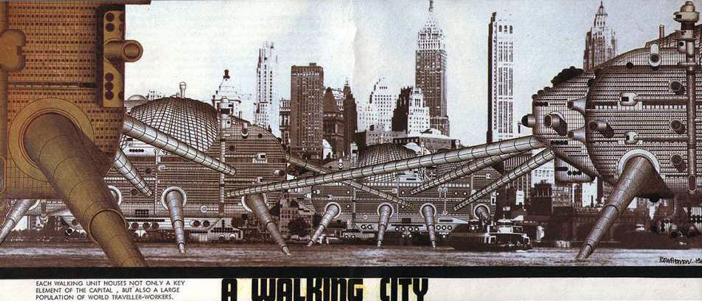
This rendering of the 1963 Walking City project by the avant-garde architectural group Archigram is captioned: “Each walking unit houses not only a key element of the capital, but also a large population of world-traveler-workers.” With its leg-like bridges, the Walking City is in the futuristic skybridge-city tradition. It is also in the city-within-a-city tradition of interconnected buildings forming self-contained complexes like the ones centered on Penn Station and Grand Central Terminal. The scheme does the motion-infused city one better—the city itself moves. Reyner Banham included this image in Megastructure, writing of its units: “Their location here in the East River, with the towers of Manhattan in the background, suggests a deliberate challenge to older visions of the future.”

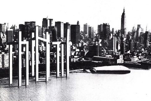
Freed from the land and knee-deep in the Hudson against a backdrop of midtown skyscrapers, Architect Steven Holl’s 1990 Parallax Towers project mirrors Archigram’s Walking City on the opposite side of Manhattan. Its “hybrid buildings” with diverse functions would be connected both underwater and by skybridges.

Holl’s 2009 Linked Hybrid project in Beijing shows that his Parallax Towers scheme was far from a pipe dream. Its eight towers linked by eight bridges house 2,500 residents and recall Matisse’s ring of dancers clasping hands—an apt metaphor for Holl’s intent to un-silo residents, generate random relationships, and “express a collective aspiration.” (They also recall Gimbels when it had a bridge on each side like outstretched arms.) The skybridges contain a swimming pool, fitness room, café, and gallery. Holl’s description places the complex in the best cinematic, layered-city, proto-megastructure New York tradition:

As a “city within a city” the new place has a filmic urban experience of space; around, over and through multifaceted spatial layers. A three-dimensional public urban space, the project has programs that vary from commercial, residential, and educational to recreational.

In this dazzling project, New York’s early skybridges reverberate across a century and around the planet. Linked Hybrid shows that their progeny can be part of a sunnier future that the dystopian ones science fiction movies depend on for dramatic tension and noir atmosphere.

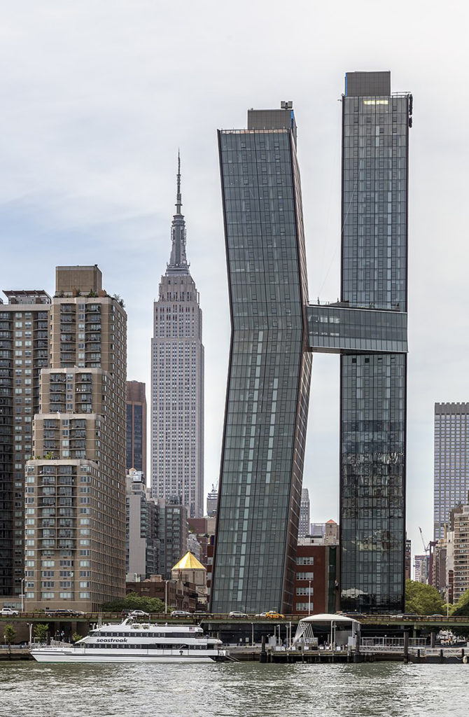
SHoP Architects’ American Copper Buildings were completed in 2018. The project’s towers are connected by a bridge containing a lap pool and lounge, touted as the highest skybridge in New York City and the first to be built in decades. It is proof of the continuing power of the Gimbels bridge, just the other side of the Empire State Building, to inspire.

What does the future hold for the Gimbels skybridge, the “Chartres” of those early spans that gave so much to the future? It cries out for the landmark designation that would protect it, but this would require also designating of the old Gimbels and Cuyler buildings that hold it up. It’s impossible to imagine this being done by our current Landmarks Preservation Commission, which wouldn’t even designate McKim, Mead & White’s adjacent Hotel Pennsylvania a landmark. The Gimbels store clearly merits consideration for landmark status. It was designed by Daniel Burnham, one of the nation’s most influential architects and urban planners.

Christopher Gray’s article stated that the buildings connected by the skybridge have been separately owned since 1994 and that plans were filed in 1995 to remove it. He speculated that the daunting cost of demolition may have stayed the bridge’s execution: “Perhaps money alone is preserving our 20th-century Chartres.” This might be enough to keep it aloft indefinitely were the Empire Station Complex abandoned. If the plan is approved, its zoning changes would greatly increase the built square footage allowed on the Gimbels site. Like most of the property that would be transformed by the Empire Station Complex, the site is owned by Vornado Realty Trust. The more extra area Vornado is allowed to build there, the less reason for it to reuse Gimbels and the more to demolish it and its skybridge, and build all new. In a better world, Vornado would recognize the cultural and potential market value of its property, and incorporate it as the base of any taller building allowed by zoning. Or the Empire Station Complex plan might be modified to make zoning increases contingent on this. That would take the intervention of more enlightened leadership; the project’s Draft Environmental Impact Statement states that there are no historic resources on the Gimbels site.

Even if no longer used as a connector, the Gimbels bridge is wide enough for its three levels to follow modern-skybridge examples and contain programmatic space. It could house tenant-attracting board rooms, lounges, or other amenities with dramatic views, accessed from one side. A little imagination and New York know-how could allow other landmark-worthy structures in the Empire Station Complex’s path to be saved without defeating the plan’s purpose. Foundations could certainly be reconfigured under Saint John the Baptist Church and the Penn Station Powerhouse to allow new tracks and platforms below. Blending authentic New York texture with new development would add great appeal. Steven Spielberg’s West Side Story, from its opening to closing credits, is a paean to the established texture of New York. Not surprisingly, the film includes a likeness of the Gimbel’s bridge.

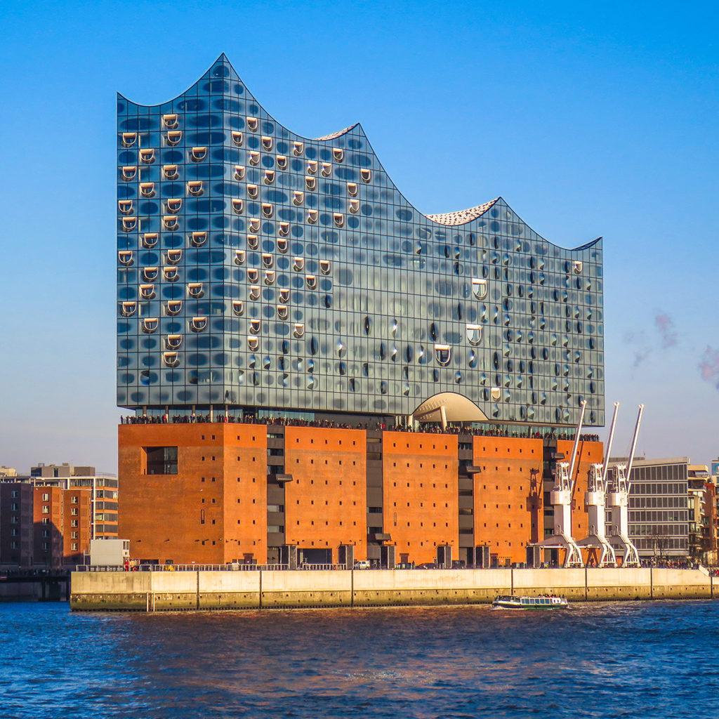
Hamburg’s Elbphilharmonie is a mixed-use complex in the megastructure tradition, housing concert halls, restaurants, bars, conference rooms, a hotel, a spa, apartments, and parking. Designed by Herzog & de Meuron and completed in 2016, the project reuses a nondescript 1960s brick warehouse as its base. The warehouse reads as an underlying archaeological stratum, expressing how Hamburg’s cultural present is built on its geography and history as a working port.

The Gimbels store could similarly serve as a value-adding base for an even larger building. Its famed designer and architectural merit aside, the building tells of the neighborhood’s intertwined garment-center and retail-district histories. Gimbels was the major competitor of nearby Macy’s, and was completed in the same year as the original Penn Station, near which it was strategically built. Such buildings tell how a neighborhood came to be. They give it historic resonance and a unique identity that can’t be made from scratch—the sort of authentic character that makes people want to live in places like New York. Recycling this embodied history would complement the environmental sustainability of adaptive reuse, for which Gimbels cries out. The nearly million-square-foot structure has enormous embedded energy, high structural capacity, tall ceilings, and abundant windows. It could be adaptively reused for any number of purposes.

Imaginative reuse of old buildings has earned growing recognition not just on environmental grounds, but critically. Last year’s Pritzker Prize—architecture’s highest honor—was awarded to Lacatan & Vassal, the French firm that prides itself on never having demolished a building to construct a new one. This is the direction of the world’s enlightened architecture today—the reverse of what the Empire Station Complex proposes. The plan’s reversion to Robert Moses-era clearcutting of whole city blocks is a special embarrassment for a city that once led the world into the future.

The Empire Station Complex would follow the formula of the unloved Hudson Yards development, but its destruction of historic architecture will make it even more regrettable. New York Times architecture critic Michael Kimmelman put his finger on Hudson Yards’ defining failure, writing that it gives physical form to “a pernicious theory of civic welfare that presumes private development is New York’s primary goal, the truest measure of urban vitality and health, with money the city’s only real currency.” Historic architecture that continues to engage the imagination and inspire is another, very real currency. Miami wouldn’t be the international brand and destination it is if South Beach’s Art Deco hotels had been replaced by larger ones rather than preserved. Who visits or moves to New York for Hudson Yards? It’s Teflon to the imagination, just as the Empire Station Complex promises to be—the very opposite of the mythic New York embodied in the Gimbels skybridge.

photo credits:

American Copper Buildings NY1 (cropped).jpg by Acroterion CC BY-SA 4.0 Int’l

Elbpjilharmonie, Hamburg.jpg by Hachercatxxy CC BY-SA 4.0 Int’l.

New plans still say “teardown” for Chelsea’s oldest house

June 10th, 2016

In an April 19 public hearing, the Landmarks Preservation Commission asked 404 West 20th Street’s new owner Ajoy Kapoor to return with a more appropriate proposal for altering it. Just released, the revised proposal will go before a public meeting of the Commission on Tuesday. The new design takes a little off the top and still appears to require virtual demolition of all but the façade of the house, the oldest in the Chelsea Historic District. Excerpted from the updated presentation by Kapoor’s architect William Suk and aligned for comparison are, left-to-right, the section of the existing house, the earlier proposal and the current proposal. The new building would still be well over twice the actual area of the approximately 4,000 square foot existing house, thanks in large part to a huge new basement excavation which would in itself make retention of the existing house difficult. In ArchiTakes’ opinion, both the form and substance of the existing house are lost in its proposed replacement. Read the rest of this entry »

Detroit’s Grand Central: Michigan Central Station

May 27th, 2015

In its much-photographed desolation, Detroit’s Michigan Central Station could be called America’s Ruin, while New York’s restored Grand Central Terminal more than ever lives up to its title as America’s Piazza San Marco.

Grand Central was one of New York’s first buildings to be targeted for landmark designation, sparing it from demolition to become one of the nation’s most celebrated urban icons and the world’s sixth-ranking tourist attraction. Michigan Central’s listing on the National Register of Historic Places protects it only from federally-funded demolition. It has survived a 2009 appeal by Detroit’s mayor for federal stimulus funds to pay for its removal and a City Council resolution that year calling on the Station’s owner to demolish it with his own money. Michigan Central lacks the landmark designation that would give it the protection it deserves, including oversight of alterations or restoration. Political realities often drive preservation decisions and may explain how the Station remains unprotected. Read the rest of this entry »

Detroit: City of the Future

August 14th, 2014

Henry Ford poses in the first car he made. In his 1922 autobiography, he wrote: “Industry will decentralize. There is no city that would be rebuilt as it is, were it destroyed – which fact is in itself a confession of our real estimate of cities. . . . The modern city has been prodigal, it is today bankrupt, and tomorrow it will cease to be.” At the time, Ford was building his vast River Rouge plant miles outside Detroit. Read the rest of this entry »

Saving the Seamen’s House YMCA

August 23rd, 2013


Designed as a waterfront YMCA for sailors, Seamen’s House has scores of multi-colored terra cotta highlights. Stylized ships’ prows, waves, and Jazz Age riffs on the YMCA’s triangle logo are deployed for maximum effect, lighting up the building’s roof line and window heads. They are an integral part of the building’s composition, and their cleaning and minimal restoration would do much to revitalize a work by great Art Deco designers. Heavy-framed, rusty security screens tell of the building’s more recent use as a prison. Their removal would also greatly improve the appeal of this easily overlooked building.

Read the rest of this entry »

Looking Over the Bike Share Gift Horse

July 12th, 2013

Central Park users rub shoulders with cars on the main loop road until 7PM on weekdays, even though Olmsted and Vaux’s 1857 park design is predicated on sunken transverse roads to block out the sight and sound of street traffic. It’s hard to say what’s worse; the exhaust sucked into lungs of joggers or the nullification of a planned and celebrated refuge from the streets. The deference to cars is striking, given that most New Yorkers don’t own one and under a quarter of Manhattan households do.

Read the rest of this entry »

Mythical Lower Manhattan, Part 2

May 6th, 2013

The 2002 World Trade Center competition entry by the team of architects Richard Meier, Peter Eisenman, Charles Gwathmey and Steven Holl is shown in its finished form at left, and in an earlier study by Holl, at right. The images are juxtaposed as they appear in Holl’s book, Urbanisms. The finished scheme has the regimentation of Upper Manhattan’s street grid while the study suggests Lower Manhattan’s off-kilter intersections. (One legend has it that the slang meaning of “square” comes from Greenwich Village’s bohemian heyday, when free thinkers lived on its unaligned streets and conformists on uptown’s rectangular blocks.) Holl asserts that the distinction mattered to him, in his book Architecture Spoken:

I had been working on a vision called Parallax Towers years before, in which I envisioned horizontal linkage of vertical thin towers. The notion of these as hybrid buildings, meaning they had offices, living, commercial aspects and they were linked in section, orchestrating what is normally known as a vertical typology into a horizontal one. The flexibility of that idea would work for the program we were given for this new project. Peter Eisenman and I fought until the end on how the horizontals should meet the verticals. I always wanted them to move, as in my original project from the early nineties, but he wanted them straight. The compromise was to keep them straight.

Despite this lost battle, Holl would speak proudly of the end result in a lecture at SCI-Arc on September 11, 2003, and bitterly reject architecture critic Paul Goldberger’s description of its “icy rationality.” Nonetheless, his earlier resistance to the squared-off default, in what he calls “endless and enormously confrontational meetings,” is telling.    Read the rest of this entry »

Mythical Lower Manhattan, Part 1 – In Memory of Lebbeus Woods

January 1st, 2013

The Dutch architectural photographer Iwan Baan took this helicopter photo of Downtown blacked-out by Hurricane Sandy. A memorable New York Magazine cover, it resonates with a century-old genre; views of a transformed Lower Manhattan from above New York Harbor.


Lebbeus Woods died on October 30th, as Sandy left his downtown neighborhood in the darkness captured by Baan’s photo. His 1999 drawing, Lower Manhattan, shows the Hudson and East Rivers dammed, draining the harbor. “The underground – or lower Manhattan – is revealed,” Woods told BLDGBLOG’s Geoff Manaugh in an interview, continuing:

So I was speculating on the future of the city and I said, well, obviously, compared to present and future cities, New York is not going to be able to compete in terms of size anymore. It used to be a large city, but now it’s a small city compared with Sao Paulo, Mexico City, Kuala Lampur or almost any Asian city of any size. So I said maybe New York can establish a new kind of scale – and the scale I was interested in was the scale of the city to the Earth, to the planet. . . . I wanted to suggest that Lower Manhattan – not lower downtown, but lower in the sense of below the city – could form a new relationship with the planet.

So it was a romantic idea – and the drawing is very conceptual in that sense.

But the exposure of the rock base, or the underground condition of the city, completely changes the scale relationship between the city and its environment. It’s peeling back the surface to see what the planetary reality is. And the new scale relationship is not about huge blockbuster buildings; it’s not about towers and skyscrapers. It’s about the relationship of the relatively small human scratchings on the surface of the earth compared to the earth itself.

Woods’ follows long traditions in both his speculation on the future of Lower Manhattan and his use of it as a scale reference. His image is prescient in omitting the World Trade Center towers. They are probably left out, along with the Manhattan Bridge, in the interest of romantic effect. Woods says he worked from aerial photographs. Some of these may have predated the World Trade Center and other blocky buildings he also left out. He’d have had plenty to choose from, given the historic popularity of the subject and viewpoint.

   Read the rest of this entry »

Statue of Liberty or Dipstick of the Apocalypse?

December 27th, 2012

This image by Owen Freeman illustrated last month’s New York Times post-Sandy op-ed by James Atlas, “Is This the End?” Freeman says in his blog that it was commissioned by Times Art Director Erich Nagler, who “proposed an underwater, Atlantis-type view of New York City.” Freeman shows working sketches for the Statue image as well as underwater views of Grand Central Terminal and a city intersection with skyscrapers. The Times’ selection of his Statue of Liberty image says something about what rattles us most. It also extends a long tradition of using the statue as a post-apocalyptic milestone, one with roots pre-dating the statue itself.

The Statue of Liberty is seen even farther submerged by global warming, but from above the water line, in Steven Spielberg’s 2001 Science Fiction film, A.I. As a sci-fi film device, this image has a clear heritage . . .

Franklin J. Shaffner’s 1968 film, Planet of the Apes, ends with this visual kicker, revealing that – spoiler alert! – the planet ruled by apes is no less than our own future earth, turned into a vast desert by man himself. Same recipe as now, but with sand substituted for water.

Planet of the Apes may have been the first film to show a ruined Statue of Liberty, but the idea has a longer history in print, as documented by the surely pseudonymous Joachim Boaz in his blog Science Fiction and Other Suspect Ruminations. He displays no fewer than six pulp science fiction covers showing the statue underwater, buried in desert sand, and discovered by spacemen or post-apocalyptic primitives. Selected above are, left to right, a 1941 magazine cover by Hubert Rogers, a 1953 magazine cover by Alex Schomburg and a 1959 novel cover by an illustrator known only as Blanchard.  These might be assumed to reflect Cold War insecurity, except for the Astounding Science Fiction cover from pre-Bomb 1941, which shows an overgrown statue approached by raft-borne throwbacks. Clearly, there’s something older at work.

The Romantic poet Percy Bysshe Shelley’s 1817 draft of Ozymandias, from Oxford’s Bodleian Library, includes squiggles that might be a premonition of a certain green gown. It reads:

I met a traveller from an antique land

Who said: “Two vast and trunkless legs of stone

Stand in the desert. Near them on the sand,

Half sunk, a shattered visage lies, whose frown

And wrinkled lip and sneer of cold command

Tell that its sculptor well those passions read

Which yet survive, stamped on these lifeless things,

The hand that mocked them and the heart that fed.

And on the pedestal these words appear:

`My name is Ozymandias, King of Kings:

Look on my works, ye mighty, and despair!’

Nothing beside remains. Round the decay

Of that colossal wreck, boundless and bare,

The lone and level sands stretch far away”.

The statue’s arrogance might throw one off the scent, but the use of a shattered human form as a cultural momento mori undeniably sets the stage for our 71 year-old ruined-liberty trope. “Look on my works, ye mighty, and despair” kicks the ladder from under whoever’s currently on the top rung. Shelley, influenced by the revolutionary writings of Thomas Paine, is thought to have been targeting the oppressive monarchy of George III.

Shelley’s poem resulted from a sonnet-writing competition with his friend Horace Smith in which both would take as their subject a ruined statue of Ramses II (photo: Mutjaba Chohan). It had recently been acquired by the British Museum and was then bound for London. Smith’s poem was originally also called Ozymandias, as the Egyptian Pharaoh was known in Greek sources. The Guardian published Shelley’s entry on January 11, 1818, and Smith’s on February 1, 1818. Smith’s version is a more direct warning to his world-dominating homeland:

In Egypt’s sandy silence, all alone,

Stands a gigantic Leg, which far off throws

The only shadow that the Desert knows.

“I am great Ozymandias,” saith the stone,

“The King of kings: this mighty city shows

The wonders of my hand.” The city’s gone!

Naught but the leg remaining to disclose

The sight of that forgotten Babylon.

We wonder, and some hunter may express

Wonder like ours, when through the wilderness

Where London stood, holding the wolf in chase,

He meets some fragment huge, and stops to guess

What wonderful, but unrecorded, race

Once dwelt in that annihilated place.

Smith is no Shelley, but in depicting a future regression of the human race he makes an astonishing leap into modern sci-fi territory, well trod from The Road Warrior to The Road. Sci-fi has always plundered more from the arts than the sciences, as witnessed by the derivation of Hollywood’s Frankenstein from Mary Shelley’s novel, published the same year as her husband’s Ozymandias.

What made the Times prefer Owen Freeman’s submerged Statue of Liberty over his underwater Grand Central? It pulls a bigger rug out from under us as an iconic symbol of America and our values, but it has another kind of potency that relates to the sacredness of the human form. Early architects believed God made man in his own image, dignifying classical architecture’s basis in the human body. Imprinted with our own form, classical architecture would no doubt retain its power for us if we learned that God looked like a duck, because the human body is also imprinted on our psyche from day one. This is why so few things disturb us as much as the visible destruction of the body, why decapitation seems more horrible than mere death. Grand Central’s classical forms may be based on the body, but the Statue of Liberty is the body. An assault on it isn’t just symbolic, but ad hominum in a way our bodies register. We identify with the peril of chin-lapping waves.  Thank the personal violence of Shelley’s “trunkless legs of stone” and “shattered visage.” Never mind that the Statue of Liberty stands for the opposite of tyranny; the subversive power and romantic appeal of Shelley’s colossal ruin irresistibly fired the imagination as soon as America brought its ready-made colossus to the center of the world stage. Old Ozymandias was just rubbing his hands in the wings.

The Chelsea Market Deal, brought to you by ULURP

November 5th, 2012


From right to left, Amanda Burden, Christine Quinn, Mayor Bloomberg and Boss Tweed reprise Thomas Nast’s ring of passed blame around Chelsea Market in a flyer that’s started appearing on Chelsea streets.


On October 19th, I and others met with City Council Speaker Christine Quinn to discuss Jamestown Properties’ proposed rezoning of Chelsea Market, aimed at adding over a quarter-million square feet of office space to the historic complex. I twice asked Speaker Quinn just how she saw the proposal making sense on zoning basics of use, bulk or environmental impact. She would only say that she hadn’t completed her review, but then still had no answer when we met six days later, just before the City Council’s land-use committee voted to support the proposal, surely with Quinn’s endorsement. Only Speaker Quinn could have stopped the project, but she advanced it in the face of overwhelming community resistance and without being able to say how it was good zoning.

If Speaker Quinn is already beholden to real estate interests in her expected run for mayor next year, she promises to bring to that office a fourth term of the Bloomberg administration’s worst feature; a pro-development, anti-oversight bias. In this New York, real estate runs politics and deals trump zoning. In a New York Times article on the Council’s Chelsea Market vote, David Chen wrote that in remaining “conspicuously quiet about the issue” and failing even to attend a public hearing on it, Quinn “left little doubt . . . that she had been the driving force behind the deal.” It’s pretty official when the Times calls it a deal. Read the rest of this entry »

Buying Michael Bolla’s Chelsea Mansion for Dummies

October 19th, 2012

A Daily News article on Michael Bolla’s restoration of 436 West 20th Street said “the house was raised 8 inches to become more level.” It appears to be tied to the house next door by a shared party wall. If Bolla raised his house without considering this, it might explain his house’s cracked and sloping façade.  


436 West 20th Street, the 1835 Chelsea row house that real estate broker Michael Bolla “restored” and marketed as Chelsea Mansion is for sale. When ArchiTakes first reported on the project’s violations, Bolla swore to a judge that he’d been defamed and trumpeted legal action aimed at me in an obliging press. The press failed to report that he never sued.

ArchiTakes finds Bolla’s row house still has issues at the Department of Buildings that any potential buyer should know about. Drawings have been filed to answer the Department’s objections from an April 7, 2010, audit, but construction hasn’t been modified to match these drawings. Read the rest of this entry »

Is the City Building Google a High Line Skybox?

July 5th, 2012

Shown in gold at top are Jamestown Properties’ proposed additions to Chelsea Market: 90,000 square feet at Ninth Avenue and 240,000 square feet at Tenth Avenue above the High Line, which is shown in green. Below is what Jamestown’s proposal might look like, give or take a floor, if it were really about needed office space and not about raiding the High Line’s light, air and sky views. Call it Scheme B. Either option would require a zoning change to increase Chelsea Market’s floor area by 330,000 square feet, but Jamestown’s would need a zoning change that would perversely allow construction within the footprint of a public park. City approval of Jamestown’s proposal is nonetheless thought to be a done deal. Read the rest of this entry »

High Noon at Chelsea Market

March 20th, 2012

The west end of Chelsea Market’s concourse incorporates the historic Nabisco complex’s train shed. About eighty feet of its distinctive clerestory window strip would be blocked by courtyard infill from Jamestown Properties’ proposed addition of a third of a million square feet of office space above it and the High Line. Jamestown’s proposal requires a zoning change that would only hurt Chelsea Market, the High Line and the community. The proposal is slated for city certification on March 26th. While this would technically begin the city’s review process, experience says certification would all but guarantee an addition to Chelsea Market, almost certainly including the cash-cow-in-the-sky office addition above the High Line that’s driving everything. By the time a project is certified, back-room handshakes have typically secured its ultimate approval. The subsequent “review process” merely affords limited opportunities for damage control and concession-seeking by the community.

Read the rest of this entry »

Jamestown’s Shady Plan for Chelsea Market

November 22nd, 2011

Last Sunday’s sunshine made the High Line’s “Tenth Avenue Square” a pleasant place to relax, even in late November. The popular grandstand feature would be cast into shadow at the hour this photo was taken if Jamestown Properties builds its planned office tower over Chelsea Market. The effect would be particularly damaging to a park highlight meant for lingering rather than strolling. Read the rest of this entry »

Last Call for Jaume Plensa’s “Echo”

August 28th, 2011

Echo, a belief-defying work by Spanish sculptor Jaume Plensa (JOW’-meh PLEHN’-sah) remains on view for only two more weeks, through September 11th. Like Plensa’s own Crown Fountain and Anish Kapoor’s Cloud Gate (aka The Bean), both in Chicago’s Millennium Park, Echo is both art and crowd-pleasing phenomenon. Sadly, unlike those works, Echo is not a permanent installation. If you’re a sympathetic ArchiTakes reader with adequate funds, please buy Echo and donate her to the City. If you haven’t seen this sculpture yet, and even if you don’t have the purchase price, do make it to Madison Square Park and take in this wonder before it vanishes back into whatever dimension it came from. Echo isn’t Plensa’s first giant, elongated female head, but it’s hard to believe she wasn’t conceived specifically for the park, with its trees, which she surreally dwarfs, and surrounding skyscrapers, whose vertical attenuation she echos. The sculpture is part of Mad. Sq. Art’s rotating exhibit series. Its accompanying plaque reads: “Inspired by the myth of the Greek nymph Echo, Plensa’s sculpture depicts the artist’s nine-year old neighbor in Barcelona, lost in a state of thoughts and dreams. Standing 44-feet tall at the center of Madison Square Park’s expansive Oval Lawn, Echo’s towering stature and white marble-dusted surface harmoniously reflect the historic limestone buildings that surround the park. Both monumental in size and inviting in subject, the peaceful visage of Echo creates a tranquil and introspective atmosphere amid the cacophony of central Manhattan.” Read the rest of this entry »

Midtown Undone

July 20th, 2011

Photographed last week, Midtown Plaza’s piecemeal demolition brings the look of a ship breaking yard to the skyline of Rochester, New York. The image may be bracing to those who remember the project’s promise of urban renewal when it was completed in 1962, to the design of urban planner Victor Gruen. According to the Wikipedia entry on Midtown, “Gruen was at the height of his influence when Midtown was completed and the project attracted international attention, including a nationally televised feature report on NBC-TV’s Huntley-Brinkley newscast the night of its opening in April 1962. City officials and planners from around the globe came to see Gruen’s solution to the mid-century urban crisis. Midtown won several design awards.”

A Jewish refugee from Nazi occupied Vienna, Gruen said he arrived in America with “an architectural degree, eight dollars, and no English.” He went from designing Fifth Avenue boutiques to a role as one of America’s premier urban planners. Melding his insights into consumer psychology with a conviction that retail spaces could create communities, Gruen invented the shopping mall. He strove to bring the urbanity of his native Vienna and Europe to America, claiming the Milan Galleria was his model for the mall. In 2004, Malcolm Gladwell wrote in The New Yorker that “Victor Gruen may well have been the most influential architect of the twentieth century” for his creation of the pervasive archetype. Gruen’s impact continues to be registered. Gladwell’s appraisal followed on the publication of Jeffrey Hardwick’s 2004 book, Mall Maker: Victor Gruen, Architect of an American Dream. A decade ago, the media theorist and concept-coiner Douglas Rushkoff began popularizing the Gruen Transfer, also known as the Gruen Effect, by which shoppers are intentionally disoriented and distracted by the retail environment, so they’ll lose focus and succumb to impulse buying. Since 2008, The Gruen Transfer has been the title of an Australian TV series on advertising. In 2009, Anette Baldauf and Katharina Weingartner released the documentary, The Gruen Effect: Victor Gruen and the Shopping Mall.

Read the rest of this entry »