Archive for the ‘Convergences’ Category

Statue of Liberty or Dipstick of the Apocalypse?

Thursday, December 27th, 2012

This image by Owen Freeman illustrated last month’s New York Times post-Sandy op-ed by James Atlas, “Is This the End?” Freeman says in his blog that it was commissioned by Times Art Director Erich Nagler, who “proposed an underwater, Atlantis-type view of New York City.” Freeman shows working sketches for the Statue image as well as underwater views of Grand Central Terminal and a city intersection with skyscrapers. The Times’ selection of his Statue of Liberty image says something about what rattles us most. It also extends a long tradition of using the statue as a post-apocalyptic milestone, one with roots pre-dating the statue itself.
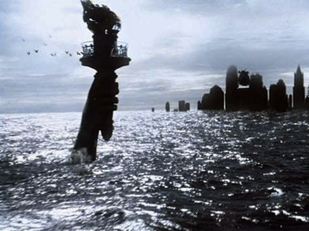
The Statue of Liberty is seen even farther submerged by global warming, but from above the water line, in Steven Spielberg’s 2001 Science Fiction film, A.I. As a sci-fi film device, this image has a clear heritage . . .
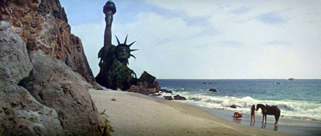
Franklin J. Shaffner’s 1968 film, Planet of the Apes, ends with this visual kicker, revealing that – spoiler alert! – the planet ruled by apes is no less than our own future earth, turned into a vast desert by man himself. Same recipe as now, but with sand substituted for water.
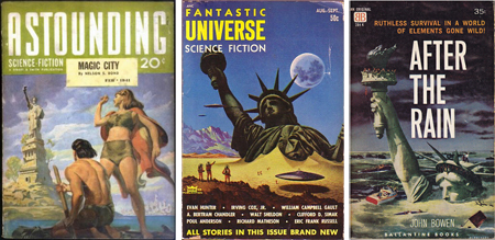
Planet of the Apes may have been the first film to show a ruined Statue of Liberty, but the idea has a longer history in print, as documented by the surely pseudonymous Joachim Boaz in his blog Science Fiction and Other Suspect Ruminations. He displays no fewer than six pulp science fiction covers showing the statue underwater, buried in desert sand, and discovered by spacemen or post-apocalyptic primitives. Selected above are, left to right, a 1941 magazine cover by Hubert Rogers, a 1953 magazine cover by Alex Schomburg and a 1959 novel cover by an illustrator known only as Blanchard.  These might be assumed to reflect Cold War insecurity, except for the Astounding Science Fiction cover from pre-Bomb 1941, which shows an overgrown statue approached by raft-borne throwbacks. Clearly, there’s something older at work.
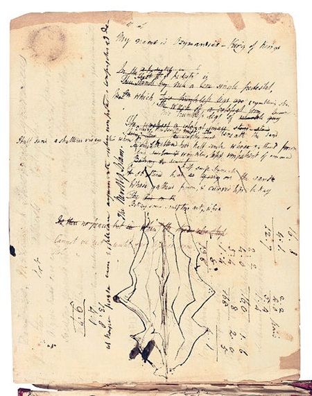
The Romantic poet Percy Bysshe Shelley’s 1817 draft of Ozymandias, from Oxford’s Bodleian Library, includes squiggles that might be a premonition of a certain green gown. It reads:

I met a traveller from an antique land

Who said: “Two vast and trunkless legs of stone

Stand in the desert. Near them on the sand,

Half sunk, a shattered visage lies, whose frown

And wrinkled lip and sneer of cold command

Tell that its sculptor well those passions read

Which yet survive, stamped on these lifeless things,

The hand that mocked them and the heart that fed.

And on the pedestal these words appear:

`My name is Ozymandias, King of Kings:

Look on my works, ye mighty, and despair!’

Nothing beside remains. Round the decay

Of that colossal wreck, boundless and bare,

The lone and level sands stretch far away”.

The statue’s arrogance might throw one off the scent, but the use of a shattered human form as a cultural momento mori undeniably sets the stage for our 71 year-old ruined-liberty trope. “Look on my works, ye mighty, and despair” kicks the ladder from under whoever’s currently on the top rung. Shelley, influenced by the revolutionary writings of Thomas Paine, is thought to have been targeting the oppressive monarchy of George III.
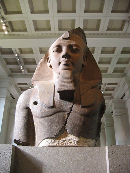
Shelley’s poem resulted from a sonnet-writing competition with his friend Horace Smith in which both would take as their subject a ruined statue of Ramses II (photo: Mutjaba Chohan). It had recently been acquired by the British Museum and was then bound for London. Smith’s poem was originally also called Ozymandias, as the Egyptian Pharaoh was known in Greek sources. The Guardian published Shelley’s entry on January 11, 1818, and Smith’s on February 1, 1818. Smith’s version is a more direct warning to his world-dominating homeland:

In Egypt’s sandy silence, all alone,

Stands a gigantic Leg, which far off throws

The only shadow that the Desert knows.

“I am great Ozymandias,” saith the stone,

“The King of kings: this mighty city shows

The wonders of my hand.” The city’s gone!

Naught but the leg remaining to disclose

The sight of that forgotten Babylon.

We wonder, and some hunter may express

Wonder like ours, when through the wilderness

Where London stood, holding the wolf in chase,

He meets some fragment huge, and stops to guess

What wonderful, but unrecorded, race

Once dwelt in that annihilated place.

Smith is no Shelley, but in depicting a future regression of the human race he makes an astonishing leap into modern sci-fi territory, well trod from The Road Warrior to The Road. Sci-fi has always plundered more from the arts than the sciences, as witnessed by the derivation of Hollywood’s Frankenstein from Mary Shelley’s novel, published the same year as her husband’s Ozymandias.

What made the Times prefer Owen Freeman’s submerged Statue of Liberty over his underwater Grand Central? It pulls a bigger rug out from under us as an iconic symbol of America and our values, but it has another kind of potency that relates to the sacredness of the human form. Early architects believed God made man in his own image, dignifying classical architecture’s basis in the human body. Imprinted with our own form, classical architecture would no doubt retain its power for us if we learned that God looked like a duck, because the human body is also imprinted on our psyche from day one. This is why so few things disturb us as much as the visible destruction of the body, why decapitation seems more horrible than mere death. Grand Central’s classical forms may be based on the body, but the Statue of Liberty is the body. An assault on it isn’t just symbolic, but ad hominum in a way our bodies register. We identify with the peril of chin-lapping waves.  Thank the personal violence of Shelley’s “trunkless legs of stone” and “shattered visage.” Never mind that the Statue of Liberty stands for the opposite of tyranny; the subversive power and romantic appeal of Shelley’s colossal ruin irresistibly fired the imagination as soon as America brought its ready-made colossus to the center of the world stage. Old Ozymandias was just rubbing his hands in the wings.
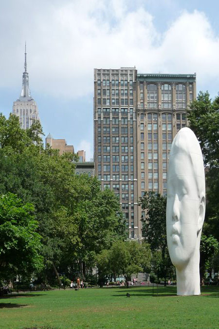
Last Call for Jaume Plensa’s “Echo”

Sunday, August 28th, 2011

Echo, a belief-defying work by Spanish sculptor Jaume Plensa (JOW’-meh PLEHN’-sah) remains on view for only two more weeks, through September 11th. Like Plensa’s own Crown Fountain and Anish Kapoor’s Cloud Gate (aka The Bean), both in Chicago’s Millennium Park, Echo is both art and crowd-pleasing phenomenon. Sadly, unlike those works, Echo is not a permanent installation. If you’re a sympathetic ArchiTakes reader with adequate funds, please buy Echo and donate her to the City. If you haven’t seen this sculpture yet, and even if you don’t have the purchase price, do make it to Madison Square Park and take in this wonder before it vanishes back into whatever dimension it came from. Echo isn’t Plensa’s first giant, elongated female head, but it’s hard to believe she wasn’t conceived specifically for the park, with its trees, which she surreally dwarfs, and surrounding skyscrapers, whose vertical attenuation she echos. The sculpture is part of Mad. Sq. Art’s rotating exhibit series. Its accompanying plaque reads: “Inspired by the myth of the Greek nymph Echo, Plensa’s sculpture depicts the artist’s nine-year old neighbor in Barcelona, lost in a state of thoughts and dreams. Standing 44-feet tall at the center of Madison Square Park’s expansive Oval Lawn, Echo’s towering stature and white marble-dusted surface harmoniously reflect the historic limestone buildings that surround the park. Both monumental in size and inviting in subject, the peaceful visage of Echo creates a tranquil and introspective atmosphere amid the cacophony of central Manhattan.” (more…)

Midtown Undone

Wednesday, July 20th, 2011

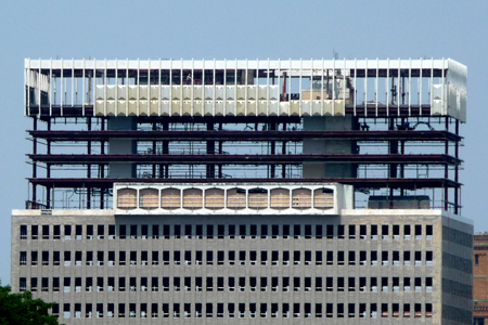
Photographed last week, Midtown Plaza’s piecemeal demolition brings the look of a ship breaking yard to the skyline of Rochester, New York. The image may be bracing to those who remember the project’s promise of urban renewal when it was completed in 1962, to the design of urban planner Victor Gruen. According to the Wikipedia entry on Midtown, “Gruen was at the height of his influence when Midtown was completed and the project attracted international attention, including a nationally televised feature report on NBC-TV’s Huntley-Brinkley newscast the night of its opening in April 1962. City officials and planners from around the globe came to see Gruen’s solution to the mid-century urban crisis. Midtown won several design awards.”

A Jewish refugee from Nazi occupied Vienna, Gruen said he arrived in America with “an architectural degree, eight dollars, and no English.” He went from designing Fifth Avenue boutiques to a role as one of America’s premier urban planners. Melding his insights into consumer psychology with a conviction that retail spaces could create communities, Gruen invented the shopping mall. He strove to bring the urbanity of his native Vienna and Europe to America, claiming the Milan Galleria was his model for the mall. In 2004, Malcolm Gladwell wrote in The New Yorker that “Victor Gruen may well have been the most influential architect of the twentieth century” for his creation of the pervasive archetype. Gruen’s impact continues to be registered. Gladwell’s appraisal followed on the publication of Jeffrey Hardwick’s 2004 book, Mall Maker: Victor Gruen, Architect of an American Dream. A decade ago, the media theorist and concept-coiner Douglas Rushkoff began popularizing the Gruen Transfer, also known as the Gruen Effect, by which shoppers are intentionally disoriented and distracted by the retail environment, so they’ll lose focus and succumb to impulse buying. Since 2008, The Gruen Transfer has been the title of an Australian TV series on advertising. In 2009, Anette Baldauf and Katharina Weingartner released the documentary, The Gruen Effect: Victor Gruen and the Shopping Mall.

(more…)

Windowflage, part 4

Thursday, February 25th, 2010

Linked Hybrid, a Beijing complex designed by Steven Holl, was completed last year.  As with his Simmons Hall dormitory at MIT, Holl sets windows deeply into a uniform and pervasive grid, camouflaging them as dimples in an enveloping waffle texture that’s applied like shrink-wrap.  He so accentuates the window grid that it takes on the geometric purity of abstract sculpture.  Like many other architects today, Holl hides his windows in plain sight.  Unlike so many others, he does this by embracing the grid rather than fleeing it. (more…)

Windowflage, part 3

Thursday, February 11th, 2010

“The Loneliest Job”, an unposed 1961 photo of JFK in the Oval Office by George Tames (The New York Times) shows how a window can express individual presence and uniqueness of outlook.  At a traditional domestic scale, even an empty window invokes human presence as surely as a Van Gogh painting of an empty chair or pair of shoes.  If the eyes are the window of the soul, windows are the eyes of the building. (more…)

“The Loneliest Job”, an unposed 1961 photo of JFK in the Oval Office by George Tames (The New York Times) shows how a window can express individual presence and uniqueness of outlook.  At a traditional domestic scale, even an empty window invokes human presence as surely as a Van Gogh painting of an empty chair or pair of shoes.  If the eyes are the window of the soul, windows are the eyes of the building. (more…)

Windowflage, part 2

Thursday, January 28th, 2010

The architect Edward Durrell Stone built this Manhattan townhouse for himself at 13 East 64th Street in 1956.  Stone’s American Embassy in New Delhi was under construction at the time of its design.  He had given the embassy a similar screen to protect it from the sun, and here recycled the idea for privacy.  Stone would go on using screens to the point of being ridiculed for it.  Nonetheless, his house introduced a new and subtle effect to New York, and it holds a key position in the history of windowflage.  It looks back to Alexander Jackson Davis’s 1835 American Institute project, with its upper floor windows camouflaged into a unified element, and forward to our own time’s layering of building-scaled veils over windows.


Alternatives to the played out tinted-glass-box approach to windowflage have been explored with increasing frequency and variety since the 1990s.  One design stream has superimposed façade-like screens over windows that are visible or expressed from below.  The screens range from the uniform and static, like Edward Durrell Stone’s mid-century forerunners, to screens with window-like voids or openable sections of their own.   (more…)

Windowflage, part 1

Thursday, January 14th, 2010


elephantine

The Coney Island Elephantine Colossus is an object lesson in the need for windowflage, the camouflaging of windows in the service of a building’s overall sculptural effect.  The work of Philadelphia architect William Free, it was built in 1883-85 as a hotel and later became a brothel.  In 1896, it departed this world in true Coney Island style by burning down.  Resolution of the conflict it illustrates, between form and fenestration, is one of the driving forces behind much recent architectural innovation on view in New York.


In his 1930 book, Precisions, Le Corbusier presented a series of sketches illustrating “the history of architecture by the history of windows throughout the ages,” culminating with his own horizontal ribbon window.  Much of the history of architecture since can be traced in the history of window camouflage.  (more…)

Architecture Meets Science Fiction at 41 Cooper Square

Friday, December 4th, 2009

ch4

Thom Mayne’s new academic building for Cooper Union, 41 Cooper Square, is the Pritzker Prize winning architect’s first building in New York. Sensual, jarring and willfully strange, it’s unlike anything else in the city. New Yorkers won’t find a meaningful introduction to Mayne or his building anywhere in the popular press.

Fifteen years ago, a Progressive Architecture editorial by Thomas Fisher titled “A House Divided” lamented the state of writing about architecture. Fisher saw a choice between “unquestioning description” by architectural journalists and “obscure, jargon-filled analysis” by academic critics. “What is rare, on either side,” Fisher wrote, “are critics who can address the underlying ideas and larger meanings of architecture and who can convey them clearly and concisely to the public and the profession.” What’s been written so far about Thom Mayne’s new academic building for Cooper Union shows how true this remains.  (more…)

The Farnsworth House, part 3 / the progeny

Thursday, October 29th, 2009


 Farnsworth.3.1

When it was completed in 1951, the Farnsworth House was a window into the future.  Still inspiring new interpretations, it has the open-endedness of great art. 

The economy with which the Farnsworth House elicits its richness of response is one proof of “less is more.”  With minimalism and technology the tines of its tuning fork, the house’s reverberations are as strong today as ever.  While it has inspired countless glass houses, a handful may provide a rough outline of its still widening influence.   (more…)

The Farnsworth House, part 2 / from the hearth to the field

Thursday, October 22nd, 2009
 
 
F2
 
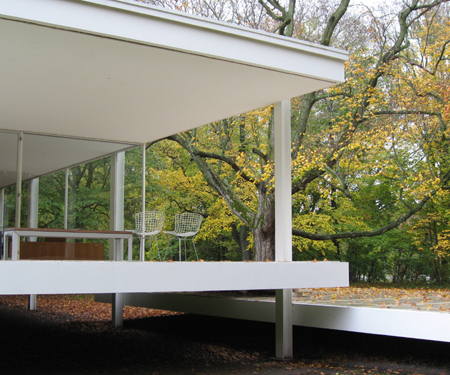
Mies van der Rohe prepared renderings of two early versions of the Farnsworth House, one on the ground and the other raised above it.  The choice to elevate its floor five feet responded to potential flooding of the nearby Fox River, but also exalted the house, made it appear to float, and gave it the character of a discrete machined object in the landscape, an effect heightened by its abstract whiteness.  Raising the house also allowed the equally expressed floor and roof planes to suggest infinite extension of its interior into surrounding space, emphasized by their projection beyond the glass envelope into the open air of the porch.  While the house was technologically remarkable for its time, the arresting design mastery at work in such effects have made it an enduring touchstone.   (more…)

The Farnsworth House, part 1 / whose less is more?

Thursday, October 15th, 2009

Farnsworth.2

Mies van der Rohe’s Farnsworth House design was publicly presented in a 1947 Museum of Modern Art retrospective of his work curated by Philip Johnson.  Mies had first conceived of a glass house in 1945.  Johnson later said, “I pointed out to him that it was impossible because you had to have rooms, and that meant solid walls up against the glass, which ruined the whole point;  Mies said, ‘I think it can be done’.”  The Farnsworth House was completed in 1951, Johnson’s own Glass House in 1949.

In Green Hills of Africa, Ernest Hemingway famously wrote, “All modern American literature comes from one book by Mark Twain called Huckleberry Finn.”  It might as accurately be said that all modern houses come from Mies van der Rohe’s Farnsworth House.  The first of its many offspring was actually built before it.  Philip Johnson, who advanced Mies’s American career by mounting a Museum of Modern Art retrospective of his work in 1947 and by steering the Seagram Building commission his way, was so inspired by Mies’s concept for a glass house that he built one for himself, beating Mies to the punch.   (more…)

An Hour of Skyscrapers

Thursday, August 27th, 2009

In his 1932 essay, The Frozen Fountain, Claude Bragdon wrote, “A building, however lofty, must end somehow, and the designer’s ability is here put to the severest test, and will be measured by the success with which this termination is affected – by the beauty with which his building dies on the white counterpane of the sky”.  The durability, if not the morbid imagery, of this view came through last month when City Planning Chair, Amanda Burden, said of Jean Nouvel’s proposed MoMA Tower, “How this building meets the sky is not only in the tradition of great New York City architecture, but it’s absolutely essential that it culminate in a very sophisticated and distinguished apex.”

Bryant Park may be the world’s best place to conduct a quick survey of skyscrapers and their tops, from Bragdon’s day to Burden’s, as demonstrated by an hour’s photos.

chrysler1

“What makes a great New York Skyscraper?  The greatest of them tug at our heartstrings.”  So wrote Nicolai Ouroussoff in his review of the new Times tower, which he found “unlikely to inspire that kind of affection.”  William Van Alen’s 1930  Chrysler Building sets the bar for heartstrings.  As Bragdon wrote in The Frozen Fountain, “The needle-pointed fleche of the Chrysler Tower catches the sunlight like a fountain’s highest expiring jet.”  Bragdon’s analogy exactly captures the imagery and emotional appeal of jazz age skysrapers:  “upward gushing fountains, most powerful and therefore highest at the center,” with surrounding “cascades descending in successive stages from the summits to which they have been upthrust.”  (more…)

Smarticulation

Thursday, August 20th, 2009

Smarticulation is facade articulation intended to make a building look purposeful and important.  It is primarily found in large buildings with glass curtainwalls and achieved by crisply projecting or recessing an area of the facade by two or three feet.  This shallow modeling has no impact on the use of the building, so it can be applied as an afterthought to a fully worked out design, and anywhere on the face of the building without impact on function.  Smarticulation is therefore often applied retroactively by designers who worry that their projects look dull. 


350

The Orion, Cetra/Ruddy Architects’ condominium tower at 350 West 42nd Street, projects smarticulation to liven up and slim down its north facade.   

Smarticulation may or may not actually occur where there’s a special function behind the articulated surface, but it neither serves nor expresses any underlying special use.  This is for the best, given that the details of a large building’s inner workings are almost certain to change during the many years that pass between its design and completion of construction.  (more…)

How to Meet the Sky

Thursday, August 13th, 2009

Philip Johnson said that outdoor sculpture “lights up the sky”.  He was talking about the way solid and void energize each other in an interplay of figure and ground, a principle that certainly applies to tall buildings.

flatiron

Flatiron Building postcard view

Much of the Flatiron Building’s appeal to artists and photographers, for example, lies in its siting on an acute intersection where views allow the sky to nearly engulf the building and come to earth.  The figure of the tower becomes more positive by virtue of the emptiness of its background, while the complementary interlocking form of the background gives the sky a positive quality.  (more…)

Influential "Life" Cartoon Turns 100

Wednesday, August 5th, 2009


walker2

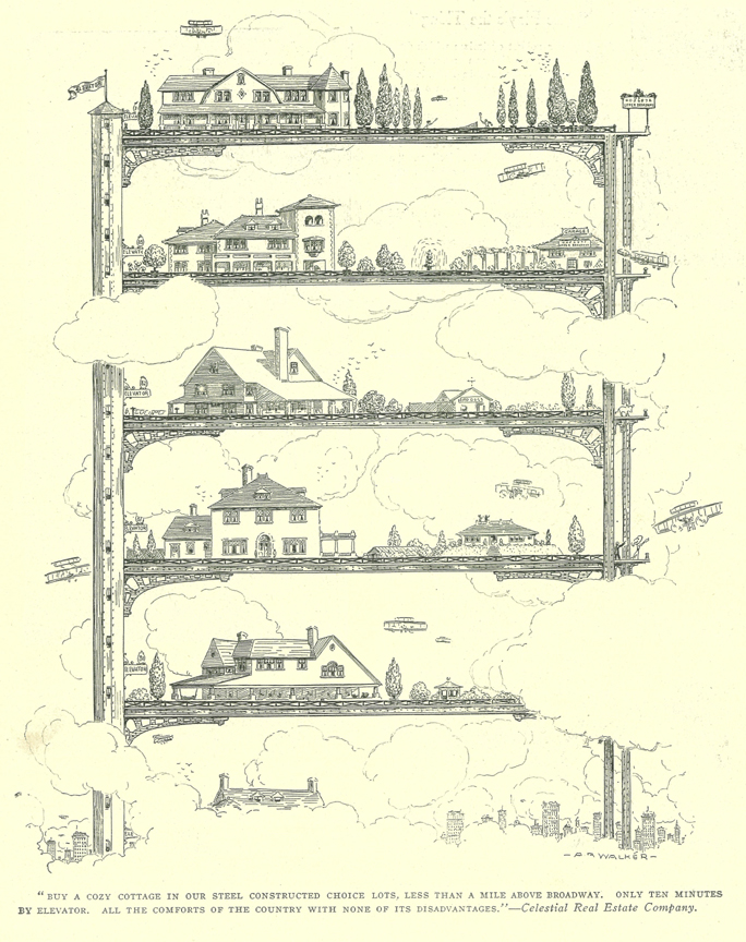
This year is the centenary of a cartoon that has had a remarkable influence on architecture.  Published in Life magazine’s “Real Estate Number” of March, 1909, the full-page cartoon by A.B. Walker shows conventional houses stacked on an open skyscraper frame.  Its caption reads, “‘Buy a cozy cottage in our steel constructed choice lots, less than a mile above Broadway.  Only ten minutes by elevator.  All the comforts of the country with none of its disadvantages.’ – Celestial Real Estate Company

Walker’s cartoon was rediscovered by Rem Koolhaas and extensively analyzed in his seminal book, Delirious New York (Oxford, 1978, pp.69-70).  Koolhaas ignored the thrust of its caption and saw in the cartoon’s picture “a theorem that describes the ideal performance of the skyscraper: a slender steel structure supports 84 horizontal planes, all the size of the original plot.  Each of these artificial levels is treated as a virgin site, as if the others did not exist, to establish a strictly private realm around a single country house and its attendant facilities, stable, servants’ cottages, etc.  Villas on the 84 platforms display a range of social aspiration from the rustic to the palatial; emphatic permutations of their architectural styles, variations in gardens, gazebos and so on, create at each elevator stop a different lifestyle and thus an implied ideology, all supported with complete neutrality by the rack.”   (more…)

Plug-in Architecture Loses an Icon

Thursday, July 30th, 2009


nakagin-scarletgreen

With Kisho Kurokawa’s Nakagin Capsule Tower (photo: Scarletgreen/Flickr) headed for demolition, the world will lose not just one of the few executed works of Japanese Metabolism, as noted earlier this month by Nicolai Ouroussoff in the New York Times, but a rare built example of plug-in architecture.  The Capsule Tower might at first appear no more than a quaint, dated vision of the future, but a look at its durable influence and vital legacy show an icon of growing historic significance whose loss will loom larger in the years to come.  (more…)