Archive for the ‘House Rules’ Category

House Rules – Afterword

Saturday, January 1st, 2011

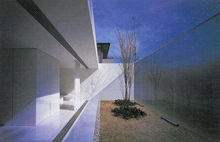
Shinichi Ogawa’s 2002 Abstract House could illustrate any of the ten House Rules. It demonstrates not just their compatibility, but their potential to enhance each other. In exploiting the strategies on which the rules are based, this modest house efficiently summons spatial luxury and an undistracted connection to nature from an ordinary site.
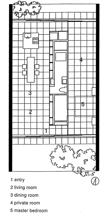
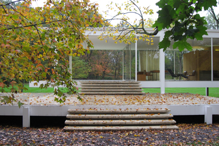
Ogawa’s floor plan successfully transplants lessons from Mies van der Rohe’s bucolic Farnsworth House into Japan’s Onomichi City. Its long side walls extend into the outdoors to embrace a small court at each end. The courtyard walls provide privacy from nearby houses and block street level distraction. The design’s minimalism gives the tiny courts a disproportionate impact, letting nature and atmospheric conditions set the tone of the house in a more dynamic and affecting way than any decorating scheme; not as pervasively as in a glass-box house but with much bigger bang for the pane. (Pivoting panels at either end of the service core can be closed to seal off the more private zone, at right above, or stand open to replicate the Farnsworth House’s spatial loop.)

The idea for House Rules grew out of a conversation with a couple who asked for a critique of a plan they had found and liked in a book of house plans. From the perspective of an architect, the design was disappointing but it was hard to say why. Singling out shortcomings didn’t sum up what was wrong with it and only seemed nitpicking. The problem wasn’t so much with what the plan was, but all that it wasn’t. A copy of James Ackerman’s book on Palladio was within reach, and next we were looking at a plan of the Villa Foscari: “See how both the house and its individual rooms are all perfect shapes, as if they were designed at once, and nothing feels like leftover space?” What would be House Rule 3 was born.

The rules presuppose small houses and reflect personal preferences, but a case can be made for their validity on both counts.

Small houses make sense for sustainability and in response to America’s soaring percentage of one- and two-person households, which are now the national norm. Houses designed for such small households are freed from substantial privacy and partitioning needs, and can pursue exciting spatial opportunities in their place, much as sports cars are freed from back seats and sensible hardtops.

Small houses can also bring custom design into reach. Lending practices require more money to be spent up front on land acquisition and construction for self-built homes as opposed to purchase of ready-made development houses. Economic necessity funnels the vast majority of new home buyers into speculative tract houses that aren’t based on what most of us want, but on marketing assumptions aimed at maximizing profits across the boards. Developers seem to take Frank Lloyd Wright’s view of the American house – a box full of boxes with holes punched in it for windows – as a description of what Americans really want and a recipe for sales success rather than a complaint. If Americans were more willing to live in compact, affordable houses, many more would be in a position to finance custom designs. They’d be living in smaller but better-fitting homes, and the typical American house would look very little as it now does. The House Rules aim to encourage this alternative by optimizing the quality of space and experience in such houses, adding value through inexpensive or cost-free design decisions.

Beyond economic considerations, whatever validity the House Rules may claim lies in the merit of the great houses from which they’re derived. It became clear in assembling them that individual rules could not only be illustrated by the majority of iconic modern houses, but that most of the houses used as examples embodied most of the rules.

The House Rules are an introduction to the possibilities that lie beyond developer housing. They aim to get more Americans into houses designed specifically for them by an architect. The rules aren’t meant as a substitute for an architect, but a prelude to a conversation with one.

House Rule 10 – Embrace Inconvenience

Thursday, October 28th, 2010

“I’d rather live in the nave of Chartres Cathedral and go out of doors to the john,” Philip Johnson told his architecture students.  His sentiment will resonate with anyone who’s ever stood in a meadow, greenhouse, park pavilion, industrial ruin or other non-house and impulsively felt “I want to live here.”  While such fantasies are soon quashed by practical priorities, they offer valid insights.   (more…)

House Rule 9 – Build for Flexibility

Thursday, September 23rd, 2010

While not the first great modern house, Mies van der Rohe’s Farnsworth House is without doubt the most influential today.  It embodies two especially pertinent ideas that support flexibility.  Its standardized industrial components suggest a demountable and reusable kit-of-parts architecture which, sixty years since, is the concept behind today’s explosive proliferation of prefabricated modular and recyclable housing solutions.  The Farnsworth House is spatially adaptable as well.  Its open plan reflects Mies’s ideal of timeless “universal space,” the usefulness of which might outlive ephemeral functional assignments.  From the wheelchair of his later years, Mies would have appreciated a further merit of this open plan; its lack of physical barriers.  Such a house has the potential to remain useful to an occupant whose own physical condition changes.  Mies raised the Farnsworth House several feet off the ground to protect it from the flooding of an adjacent river, abandoning an on-grade alternative scheme might have made it truly accessible. (more…)

House Rule 8 – Use Trees

Thursday, August 5th, 2010


“Light takes the Tree; but who can tell us how?”  Theodore Roethke asked in his 1953 poem, “The Waking.” Trees have been our natural environment since before we came down from them, and they hold a deeply embedded place in the human psyche.  Their generations of leaves are an intuitive metaphor for death and renewal.  In a poem that contemplates mortality, did Roethke want his listeners to unconsciously hear “blight takes the tree?”  Or just recall the redemptive wonder we feel on seeing a tree mysteriously transformed by sunlight?  Beyond a metaphysical import, every tree has specific qualities that might influence its selection as an intermediary between artificial shelter and nature.  The poplar pictured above, for example, has brittle leaves that make the wind audible as a gentle clapping.   (more…)

House Rule 7 – Optimize Natural Light

Thursday, July 22nd, 2010

Johannes Vermeer’s The Music Lesson was painted in the early 1660s.  As in most of Vermeer’s thirty-odd paintings, light enters from the left, spreading itself across a rear wall.  The situation is modeled on his studio, where a window and wall intersected to create just such a wash of illumination.  While light can be visibly suspended in the thick air of haze or smoke, it typically manifests itself on the surfaces it strikes.  Vermeer portrayed this presence so strongly that light is said to be a character in his paintings.   (more…)

House Rule 6 – Integrate Furniture

Thursday, June 10th, 2010


Architect Jørn Utzon’s home, Can Lis, was completed in 1972.  Composed of individual structures and courtyards, it stands on a cliff overlooking the sea in Majorca, Spain.  A one-room building at its center contains a built-in crescent seat facing the vista through deep openings, with a fireplace on one side. (more…)

House Rule 5 – Engage the Outdoors

Thursday, May 27th, 2010


An illustration from William A. Bruette’s 1934 book, Log Camps & Cabins, shows an example of a cabin open at one end like a cave.  Outside, a campfire extends the domestic realm into nature.  The composition is the barest refinement of primitive man’s cave with banked fire outside.  The book’s epigraph reads:  “The cabin in the forest, on the banks of a quiet lake or buried in the wilderness back of beyond, is an expression of man’s desire to escape the exactions of civilization and secure rest and seclusion by a return to the primitive.”  Or in Huck Finn’s words, “The Widow Douglas she took me for her son, and allowed she would sivilize me; but it was rough living in the house all the time, considering how dismal regular and decent the widow was in all her ways; and so when I couldn’t stand it no longer I lit out. I got into my old rags and my sugar-hogshead again, and was free and satisfied.”  Few humans would prefer any kind of architecture to the pleasure and freedom of being outdoors in comfortable weather.  Even without retreating “back of beyond,” houses can make the most of their devil’s bargain between shelter and space. (more…)

House Rule 4 – Pursue a One-Room Ideal

Thursday, May 13th, 2010

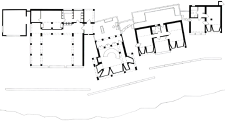
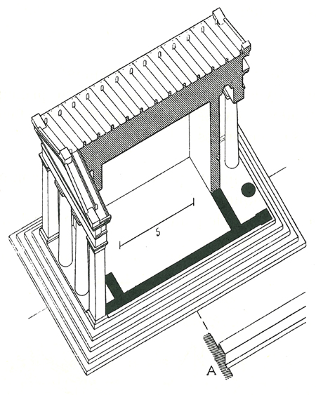
A cutaway drawing of the Temple of Diana Propylaea at Eleusis illustrates Auguste Choisy’s 1899 Histoire de L’Architecture.  From tepees to temples to iconic mid-century glass houses, one-room buildings derive a primitive power from their simple integration of interior and exterior. (more…)

House Rule 3 – Design from a Diagram

Thursday, April 29th, 2010

“A Lake or River Villa for a Picturesque Site” illustrates A.J. Downing’s 1850 book, The Architecture of Country Houses. Its orderly cruciform plan of perfectly shaped rooms is undisturbed by the messy supporting business of kitchen, laundry and storage hidden out back.  Unprepared for the encroachment of modern equipment, the villa’s designer simply tacks on a perfunctory service wing that drifts off the page while he focuses on the familiar building blocks of room and stair.  Today’s house designer has even more services to integrate, with bathrooms, wrap-around kitchens, utility rooms and attached garages.  He seems just as ill prepared to integrate these, and often puts up a dummy house-front of formal rooms to simplify composition of the street façade and to serve as an uninhabited buffer zone shielding the private family spaces and their services in back.  As with Downing’s example, the rear face of today’s house is a secondary concern.  The accidental backs to be glimpsed across rear yards of housing tracts attest to this.  Modern house-plan fare visibly strains to juggle curb appeal, integrity of rooms, and integrated services.  Downing’s example drops the ball on incorporation of services in favor of whole rooms and a picturesque face.   (more…)

House Rule 2 – Combine Living Spaces

Thursday, April 15th, 2010


Frank Lloyd Wright’s Hickox House of 1900 opens its dining room, living room and library onto each other, combining them into a single expansive living space that runs the full length of the house.  The glazed ends of this space imply its infinite exterior projection, even as the doors leading from its center onto a terrace allow the living room to spill outside.  “Vista without and vista within,” were Wright’s words for the effect.  The outward thrust of the living space is countered by its focal hearth.  Wright attuned his houses to the ingrained daily rhythm by which our forebears faced outward to hunt and gather in the landscape by day and returned to the fire at night, tapping into the primitive brain with the calculation of a movie about alien predators.  In its human insight, its simultaneous appropriation of exterior space and indoor simulation of outdoor scale, and its diagrammatic clarity – pure living pavilion on one side and unintruding support functions on the other – the Hickox House is a particularly compact illustration of Wright’s multilevel genius.  It was a radical dwelling in its time.  In his 1954 book, The Natural House, Wright described how he had broken the box of the American house a half-century earlier:

“Dwellings of that period were cut up, advisedly and completely, with the grim determination that should go with any cutting process.  The interiors consisted of boxes beside boxes or inside boxes, called rooms.  All boxes were inside a complicated outside boxing.  Each domestic function was properly box to box.  I could see little sense in this inhibition, in this cellular sequestration that implied ancestors familiar with penal institutions, except for the privacy of bedrooms on the upper floor.  They were perhaps all right as sleeping boxes.  So I declared the whole lower floor as one room, cutting off the kitchen as a laboratory . . .  Then I screened various portions of the big room for certain domestic purposes like dining and reading.  There were no plans in existence like these at the time. . . .  The house became more free as space and more livable too.  Interior spaciousness began to dawn.”

The lived-in rear of today’s typical American house, with its combined kitchen, informal dining area and family room, owes its existence to Wright’s pioneering vision, even as today’s self-contained, under-used and obligatory formal living and dining rooms are over a century behind him.


Rule 2 is to combine living spaces.

Who has more?

Combine living, dining and other activity areas to partake of each other’s space.  Create a single generous area rather than several smaller constrained rooms.  If private activity areas are needed, incorporate them in bedrooms or circulation space, so these do double-duty.  Most homeowners spend the great majority of their at-home waking time not only in a favorite room, but on one or two favorite pieces of furniture, and even the richest mansion owner can experience only one room at a time.  Redirect resources from unnecessary partitions and redundant spaces into the best of all possible – and always used – living spaces.

Continue to House Rule 3

House Rule 1 – Build a Small and Simple Shell

Thursday, April 1st, 2010

Cape Cod, saltbox, colonial, barn; American vernacular prototypes have simple rectangular plans, and shapes that are mere extrusions of their end walls.  These plain and practical forms represent the oldest and arguably most authentic stream of American domestic architecture. (more…)

House Rules – Introduction

Thursday, March 11th, 2010


A 1958 Corvette, one of the last models designed by the line’s visionary creator, Harley Earl.

No design product is more quintessentially American than a first generation Corvette.  Much of its appeal lies in just how little it puts between its occupants and the road and open air.  It is as much about the experience it promises (and delivers) as about its material allure.  The two-seater’s reductiveness is arguably far more American than the prevailing national tendency toward bigness.  Today’s ubiquitous SUVs hold only an empty promise of off-road driving.  They are parked outside equally pointless and oversized houses full of formal spaces and bedrooms that are never used, “empty guest chambers for empty guests,” as Thoreau observed of the typical American house over a century and a half ago in Walden.

The American house has doubled in size since the first Corvette was launched in the 1950s, even as households have become smaller.  According to the 2000 census, less than a third of American households are families with children under 18 at home, and over a quarter are individuals living alone.

American life needs a new vehicle.  American literature offers the introduction to the rules of its design.     (more…)