Cape Cod, saltbox, colonial, barn; American vernacular prototypes have simple rectangular plans, and shapes that are mere extrusions of their end walls. These plain and practical forms represent the oldest and arguably most authentic stream of American domestic architecture. Read the rest of this entry »
House Rule 1 – Build a Small and Simple Shell
April 1st, 2010436 West 20th Street Rises Above the Law
March 18th, 2010White stains of efflorescence mark new brickwork at 436 West 20th Street. The gable end of the 1835 rowhouse has been raised several feet and given a gambrel profile. The original peaked roofline is clearly legible in darker-looking brick, about four feet down from the new roofline. “You have to pay attention to history,” the building’s new owner and co-developer, Michael Bolla was quoted in the Daily News last month. “It tells you everything. Here history told us to spare no expense to return the house to its original form. This house has all kinds of history.” The house in fact falls within the Chelsea Historic District, and its exterior is therefore the equivalent of a designated landmark. In raising its roofline, Bolla has violated the permit his renovation was issued by the Landmarks Preservation Commission. With the raised gable end, Bolla appears to be setting the stage for a raised roof, and maximum exploitation of a penthouse he clearly views as a cash cow. Read the rest of this entry »
House Rules – Introduction
March 11th, 2010
A 1958 Corvette, one of the last models designed by the line’s visionary creator, Harley Earl.
No design product is more quintessentially American than a first generation Corvette. Much of its appeal lies in just how little it puts between its occupants and the road and open air. It is as much about the experience it promises (and delivers) as about its material allure. The two-seater’s reductiveness is arguably far more American than the prevailing national tendency toward bigness. Today’s ubiquitous SUVs hold only an empty promise of off-road driving. They are parked outside equally pointless and oversized houses full of formal spaces and bedrooms that are never used, “empty guest chambers for empty guests,” as Thoreau observed of the typical American house over a century and a half ago in Walden.
The American house has doubled in size since the first Corvette was launched in the 1950s, even as households have become smaller. According to the 2000 census, less than a third of American households are families with children under 18 at home, and over a quarter are individuals living alone.
American life needs a new vehicle. American literature offers the introduction to the rules of its design. Read the rest of this entry »
Windowflage, part 4
February 25th, 2010Linked Hybrid, a Beijing complex designed by Steven Holl, was completed last year. As with his Simmons Hall dormitory at MIT, Holl sets windows deeply into a uniform and pervasive grid, camouflaging them as dimples in an enveloping waffle texture that’s applied like shrink-wrap. He so accentuates the window grid that it takes on the geometric purity of abstract sculpture. Like many other architects today, Holl hides his windows in plain sight. Unlike so many others, he does this by embracing the grid rather than fleeing it. Read the rest of this entry »
Windowflage, part 3
February 11th, 2010“The Loneliest Job”, an unposed 1961 photo of JFK in the Oval Office by George Tames (The New York Times) shows how a window can express individual presence and uniqueness of outlook. At a traditional domestic scale, even an empty window invokes human presence as surely as a Van Gogh painting of an empty chair or pair of shoes. If the eyes are the window of the soul, windows are the eyes of the building. Read the rest of this entry »
“The Loneliest Job”, an unposed 1961 photo of JFK in the Oval Office by George Tames (The New York Times) shows how a window can express individual presence and uniqueness of outlook. At a traditional domestic scale, even an empty window invokes human presence as surely as a Van Gogh painting of an empty chair or pair of shoes. If the eyes are the window of the soul, windows are the eyes of the building. Read the rest of this entry »
Windowflage, part 2
January 28th, 2010The architect Edward Durrell Stone built this Manhattan townhouse for himself at 13 East 64th Street in 1956. Stone’s American Embassy in New Delhi was under construction at the time of its design. He had given the embassy a similar screen to protect it from the sun, and here recycled the idea for privacy. Stone would go on using screens to the point of being ridiculed for it. Nonetheless, his house introduced a new and subtle effect to New York, and it holds a key position in the history of windowflage. It looks back to Alexander Jackson Davis’s 1835 American Institute project, with its upper floor windows camouflaged into a unified element, and forward to our own time’s layering of building-scaled veils over windows.
Alternatives to the played out tinted-glass-box approach to windowflage have been explored with increasing frequency and variety since the 1990s. One design stream has superimposed façade-like screens over windows that are visible or expressed from below. The screens range from the uniform and static, like Edward Durrell Stone’s mid-century forerunners, to screens with window-like voids or openable sections of their own. Read the rest of this entry »
The architect Edward Durrell Stone built this Manhattan townhouse for himself at 13 East 64th Street in 1956. Stone’s American Embassy in New Delhi was under construction at the time of its design. He had given the embassy a similar screen to protect it from the sun, and here recycled the idea for privacy. Stone would go on using screens to the point of being ridiculed for it. Nonetheless, his house introduced a new and subtle effect to New York, and it holds a key position in the history of windowflage. It looks back to Alexander Jackson Davis’s 1835 American Institute project, with its upper floor windows camouflaged into a unified element, and forward to our own time’s layering of building-scaled veils over windows.
Alternatives to the played out tinted-glass-box approach to windowflage have been explored with increasing frequency and variety since the 1990s. One design stream has superimposed façade-like screens over windows that are visible or expressed from below. The screens range from the uniform and static, like Edward Durrell Stone’s mid-century forerunners, to screens with window-like voids or openable sections of their own. Read the rest of this entry »
Windowflage, part 1
January 14th, 2010
The Coney Island Elephantine Colossus is an object lesson in the need for windowflage, the camouflaging of windows in the service of a building’s overall sculptural effect. The work of Philadelphia architect William Free, it was built in 1883-85 as a hotel and later became a brothel. In 1896, it departed this world in true Coney Island style by burning down. Resolution of the conflict it illustrates, between form and fenestration, is one of the driving forces behind much recent architectural innovation on view in New York.
In his 1930 book, Precisions, Le Corbusier presented a series of sketches illustrating “the history of architecture by the history of windows throughout the ages,” culminating with his own horizontal ribbon window. Much of the history of architecture since can be traced in the history of window camouflage. Read the rest of this entry »
The Iron Triangle, part 2 / from Kowloon Walled City to Singapore
December 31st, 2009
No place in New York elicits such wonder at the retina’s capacity as the Iron Triangle. Self-contained, densely packed and eye-boggling, it is an alternate reality recalling Hong Kong’s Kowloon Walled City, demolished in 1993-4, below.
Comparing the vibrancy of the Iron Triangle to the city’s canned and bland development plan for it brings to mind William Gibson’s 1993 Wired article on Singapore, “Disneyland with the Death Penalty.” Gibson finds Singapore a sanitized theme park where the physical past “has almost entirely vanished” and “the fuzzier brands of creativity are in extremely short supply.” “It’s boring here,” he writes, calling Singapore a habitable “version of convention-zone Atlanta,” at risk of becoming a “smug, neo-Swiss enclave of order and prosperity.” Gibson ends the piece with his departure of Singapore by way of Hong Kong’s airport, where he finds a counterpoint:
“In Hong Kong I’d seen huge matte black butterflies flapping around the customs hall, nobody paying them the least attention. I’d caught a glimpse of the Walled City of Kowloon, too. Maybe I could catch another, before the future comes to tear it down.
Traditionally the home of pork-butchers, unlicensed denturists, and dealers in heroin, The Walled City still stands at the foot of a runway, awaiting demolition. Some kind of profound embarrassment to modern China, its clearance has long been made a condition of the looming change of hands.
Hive of dream. Those mismatched, uncalculated windows. How they seem to absorb all the frantic activity of Kai Tak airport, sucking in energy like a black hole.
I was ready for something like that. . . .
I loosened my tie, clearing Singapore airspace.” Read the rest of this entry »
The Iron Triangle, part 1 / Wilson’s Garage
December 17th, 2009
Once a swamp and then an ash dump, the ground of the Iron Triangle in Willets Point, Queens, now feels like both. Its businesses have an unacknowledged ancestor within one of the greatest works of American literature.
The Great Gatsby was going to be called Among Ash Heaps and Millionaires until the great Scribners editor Max Perkins persuaded F. Scott Fitzgerald otherwise. Bad as it was, Fitzgerald’s working title serves to tell how much importance he placed on the novel’s “valley of ashes,” the setting for George Wilson’s garage in the novel. The valley of ashes was based on the sprawling Corona dump which would be regraded and buried – under the 1939 World’s Fair site, now Corona Flushing Meadows Park, and Shea stadium – except for the corner of it at the tip of Willets Point that was left to its own devices and just maniacally proliferated car repair shops until it came to be known as the Iron Triangle. ArchiTakes’ search for Wilson’s Garage finds that it was almost certainly located within the Iron Triangle, a unique district whose days are numbered in the path of a city initiated development plan. Read the rest of this entry »
Architecture Meets Science Fiction at 41 Cooper Square
December 4th, 2009
Thom Mayne’s new academic building for Cooper Union, 41 Cooper Square, is the Pritzker Prize winning architect’s first building in New York. Sensual, jarring and willfully strange, it’s unlike anything else in the city. New Yorkers won’t find a meaningful introduction to Mayne or his building anywhere in the popular press.
Fifteen years ago, a Progressive Architecture editorial by Thomas Fisher titled “A House Divided” lamented the state of writing about architecture. Fisher saw a choice between “unquestioning description” by architectural journalists and “obscure, jargon-filled analysis” by academic critics. “What is rare, on either side,” Fisher wrote, “are critics who can address the underlying ideas and larger meanings of architecture and who can convey them clearly and concisely to the public and the profession.” What’s been written so far about Thom Mayne’s new academic building for Cooper Union shows how true this remains. Read the rest of this entry »
5 Folding Bikes for the City
November 20th, 2009Brompton World Championship racers in obligatory jacket and tie depart from Blenheim Palace. The dress code suggests both the folding bike’s roots in English quirkiness and its usefulness for urban commuting.
There’s no better way to take possession of a city than on a compact folding bike. Neighborhoods that would be discouragingly distant on foot become only minutes away. Distant communities that might otherwise go unexplored become riding destinations with the option of making part of the trip on a bus or train next to one’s unobtrusively folded mount. A folder can be carried into shops and restaurants, avoiding the inconvenience and unreliability of chaining up outdoors. Owning a truly compact folder is like having a bike in your back pocket. It can shrink an entire city. Not only does such a bike take you to fresh places in town, it does so without compromising the spatial immediacy of walking. Philippe Starck has said, “frankly, it isn’t Manhattan that interests me. The center of Manhattan is very civilized, a nice international city. I am more interested in the passion of New York, and that’s why I go with my motorcycle or bicycle to the Bronx, Queens and Harlem. There, you are like a spectator in front of the most beautiful drama in the world. Every corner of the street seems like an opera stage, a stage for drama. The vibrations there are very strong.” Read the rest of this entry »
The Farnsworth House, part 3 / the progeny
October 29th, 2009
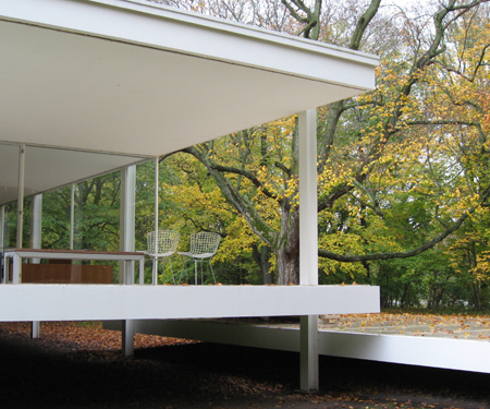
When it was completed in 1951, the Farnsworth House was a window into the future. Still inspiring new interpretations, it has the open-endedness of great art.
The economy with which the Farnsworth House elicits its richness of response is one proof of “less is more.” With minimalism and technology the tines of its tuning fork, the house’s reverberations are as strong today as ever. While it has inspired countless glass houses, a handful may provide a rough outline of its still widening influence. Read the rest of this entry »
The Farnsworth House, part 2 / from the hearth to the field
October 22nd, 2009The Farnsworth House, part 1 / whose less is more?
October 15th, 2009Mies van der Rohe’s Farnsworth House design was publicly presented in a 1947 Museum of Modern Art retrospective of his work curated by Philip Johnson. Mies had first conceived of a glass house in 1945. Johnson later said, “I pointed out to him that it was impossible because you had to have rooms, and that meant solid walls up against the glass, which ruined the whole point; Mies said, ‘I think it can be done’.” The Farnsworth House was completed in 1951, Johnson’s own Glass House in 1949.
In Green Hills of Africa, Ernest Hemingway famously wrote, “All modern American literature comes from one book by Mark Twain called Huckleberry Finn.” It might as accurately be said that all modern houses come from Mies van der Rohe’s Farnsworth House. The first of its many offspring was actually built before it. Philip Johnson, who advanced Mies’s American career by mounting a Museum of Modern Art retrospective of his work in 1947 and by steering the Seagram Building commission his way, was so inspired by Mies’s concept for a glass house that he built one for himself, beating Mies to the punch. Read the rest of this entry »
Mies van der Rohe’s Farnsworth House design was publicly presented in a 1947 Museum of Modern Art retrospective of his work curated by Philip Johnson. Mies had first conceived of a glass house in 1945. Johnson later said, “I pointed out to him that it was impossible because you had to have rooms, and that meant solid walls up against the glass, which ruined the whole point; Mies said, ‘I think it can be done’.” The Farnsworth House was completed in 1951, Johnson’s own Glass House in 1949.
In Green Hills of Africa, Ernest Hemingway famously wrote, “All modern American literature comes from one book by Mark Twain called Huckleberry Finn.” It might as accurately be said that all modern houses come from Mies van der Rohe’s Farnsworth House. The first of its many offspring was actually built before it. Philip Johnson, who advanced Mies’s American career by mounting a Museum of Modern Art retrospective of his work in 1947 and by steering the Seagram Building commission his way, was so inspired by Mies’s concept for a glass house that he built one for himself, beating Mies to the punch. Read the rest of this entry »
The Seminary Block of West 20th Street
October 8th, 2009
The General Theological Seminary’s Chapel of the Good Shepherd overlooks the center of one of New York’s best blocks. The Seminary’s brick collegiate gothic buildings were designed by Charles Coolidge Haight. The Chapel and bell tower of his design were built in 1886-88.
The block of West 20th Street in Chelsea between Ninth and Tenth Avenues is one of New York’s most graceful. It makes for an excellent way to approach or leave the current north end of the newly opened High Line park, just across Tenth Avenue. Read the rest of this entry »
Mapping New York's Shoreline, 1609-2009
October 1st, 2009
Henry Wellge’s “Greatest New York”, published by The New York Times Company in 1911 and featured in a new exhibition at the New York Public Library, places the city within a liquid embrace. Its foreground features the Jersey City waterfront. New Jersey commuters transferred from Central Railroad of New Jersey trains onto ferries bound for Lower Manhattan, tracing a ferry route first established in 1661. The New Jersey ferry slips are at center in the detail below.
“. . . I became aware of the old island that flowered once for Dutch sailors’ eyes – a fresh, green breast of the new world. Its vanished trees . . . had once pandered in whispers to the last and greatest of all human dreams; for a transitory enchanted moment man must have held his breath in the presence of this continent, compelled into an aesthetic contemplation he neither understood nor desired, face to face for the last time in history with something commensurate to his capacity for wonder.” – F. Scott Fitzgerald, The Great Gatsby Read the rest of this entry »