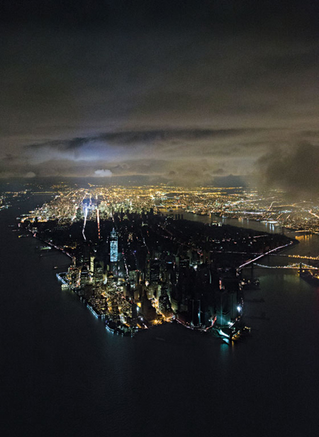
The Dutch architectural photographer Iwan Baan took this helicopter photo of Downtown blacked-out by Hurricane Sandy. A memorable New York Magazine cover, it resonates with a century-old genre; views of a transformed Lower Manhattan from above New York Harbor.

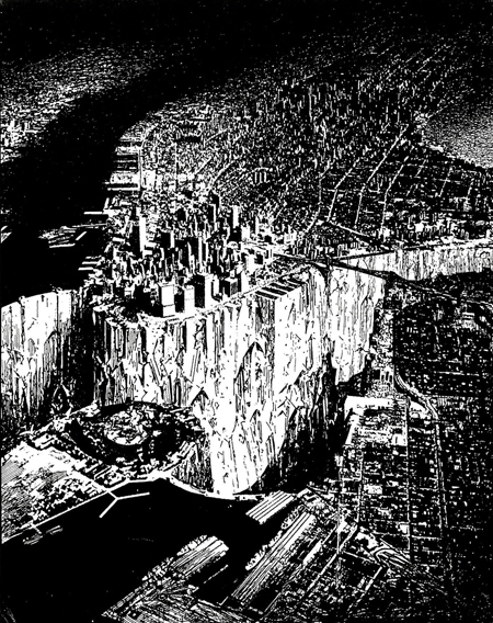
Lebbeus Woods died on October 30th, as Sandy left his downtown neighborhood in the darkness captured by Baan’s photo. His 1999 drawing, Lower Manhattan, shows the Hudson and East Rivers dammed, draining the harbor. “The underground – or lower Manhattan – is revealed,” Woods told BLDGBLOG’s Geoff Manaugh in an interview, continuing:
So I was speculating on the future of the city and I said, well, obviously, compared to present and future cities, New York is not going to be able to compete in terms of size anymore. It used to be a large city, but now it’s a small city compared with Sao Paulo, Mexico City, Kuala Lampur or almost any Asian city of any size. So I said maybe New York can establish a new kind of scale – and the scale I was interested in was the scale of the city to the Earth, to the planet. . . . I wanted to suggest that Lower Manhattan – not lower downtown, but lower in the sense of below the city – could form a new relationship with the planet.
So it was a romantic idea – and the drawing is very conceptual in that sense.
But the exposure of the rock base, or the underground condition of the city, completely changes the scale relationship between the city and its environment. It’s peeling back the surface to see what the planetary reality is. And the new scale relationship is not about huge blockbuster buildings; it’s not about towers and skyscrapers. It’s about the relationship of the relatively small human scratchings on the surface of the earth compared to the earth itself.
Woods’ follows long traditions in both his speculation on the future of Lower Manhattan and his use of it as a scale reference. His image is prescient in omitting the World Trade Center towers. They are probably left out, along with the Manhattan Bridge, in the interest of romantic effect. Woods says he worked from aerial photographs. Some of these may have predated the World Trade Center and other blocky buildings he also left out. He’d have had plenty to choose from, given the historic popularity of the subject and viewpoint.

Illustrator Louis Biederman’s New York City as it will be in 1999 was widely circulated via the Sunday Edition of Joseph Pulitzer’s New York World on December 30th, 1900. A where-will-it-all-end reverie on Lower Manhattan’s proliferation of skyscrapers and bridges, the image inaugurates a convention of setting a future scene with fantastic airships. They contribute to a pulsating vision of layered transportation systems that would inform later images like King’s Dream of New York and reach cinematic apotheosis in the buzzing dystopian city of Fritz Lang’s Metropolis.

Harry Grant Dart’s Some Day, in detail above, followed Biederman’s lead. Dart’s image indulged his particular penchant for fantasy airships. It appeared in the March 4, 1909, Real Estate Number of Life Magazine, alongside A.B. Walker’s influential cartoon of a skyscraper frame planted with suburban houses. (Walker’s cartoon would be revisited by Rem Koolhaas’s 1978 seminal book Delirious New York and SITE’s 1981 Highrise of Homes experimental proposal.) The 44-page Life issue includes four more futuristic views of New York, alongside eight ads for cars and six for car-related products, which paint a more accurate picture of the future.

Aerial photos of Lower Manhattan like this one of around 1930 are a staple of the era’s postcards. This example is one of many that oblige earlier expectations by delivering a foreground airship, in this case the USS Akron. It captures the locale fulfilling its role as the future’s cutting edge, farther ahead of the world than it would ever be again, and just about to be frozen as such by decades of depression, war and recovery.

Architect Raymond Hood began proposing East and Hudson River bridges with 50 to 60 story residential skyscrapers as support pylons in 1925. In 1930 he presented this photomontage of Manhattan densely ringed with residential bridges and interspersed with mountain-like clusters of skyscrapers at selected street intersections. It recalls Louis Biederman’s cartoon, New York City as it will be in 1999, both in what it envisions and its title. Hood looked forward only twenty years, calling his project Manhattan 1950. His melding of residential building and bridge is an early step in the direction of 1960s megastructures, monumental frameworks accommodating structure, transportation and all the functions of a city. The megastructure movement reflected architects’ conviction at the time of their responsibility to design the whole human environment, a scary prospect indeed.

Reyner Banham astutely identified the appeal of Lower Manhattan as a canvas for new visions of the future. His 1976 book Megastructure is illustrated with this image of Archigram’s 1963 Walking City project, showing the conceptual architectural group’s walking cities against a backdrop of Wall Street skyscrapers. Banham’s caption reads: “Their location here in the East River, with the towers of Manhattan in the background, suggests a deliberate challenge to older visions of the future . . .” By the sixties, Lower Manhattan had become the standard against which to measure urban visions, sealing its own mythic status.

Lower Manhattan’s use as a measuring stick for new urban visions followed upon its use as a scale reference. The outline of Albert Kahn Associates’ vast Dodge Chicago Aircraft Engine Plant, built for the war effort, was superimposed on Lower Manhattan in the December 1943 issue of The Architectural Forum. While a New Yorker could compare the length of this factory to a walk from the the Battery to the Bowery, the rest of the world could by now relate as well to what had become an iconic cityscape and universal point of reference. The manner in which the plant’s outline passes out of sight behind buildings as it weaves among them surpasses the purpose at hand and speaks of this terrain’s power to fire the imagination. The image foreshadows visions of city-containing buildings, sometimes rendered as visitors to New York.

Superstudio’s theoretical Continuous Monument of 1969 picks up where The Architectural Forum’s Dodge Plant image left off, encircling the very same skyscraper blocks. The Dodge Plant outline is not an unlikely influence, given its publication in a major architectural journal and its remarkable similarities. In the words of Superstudio’s Toraldo di Francia, The Continuous Monument was “a form of architecture” reflecting a “world rendered uniform by technology, culture and all the other inevitable forms of imperialism.” Fellow member Adolfo Natalini said, “. . . in 1969, we started designing negative utopias like The Continuous Monument – images warning of the horrors architecture had in store with its scientific methods for perpetuating standard models worldwide. Of course, we were also having fun.” The ultimate sixties megastructure, The Continuous Monument would circle the planet, carrying to its logical conclusion the International Style’s vocabulary of rational, gridded rectangular extrusions, and its arrogation of universal applicability to a world homogenized by progress. Manhattan’s transfixed skyscrapers are a foil for this new future, contrasting old-school object buildings and individuality with a uniform structure beyond architecture. As in Lebbeus Woods’ Lower Manhattan image, the World Trade Center towers are omitted, although The Continuous Monument co-opts and critiques their scaleless box-tube vocabulary.

The most abstracted scheme for the 2002 World Trade Center competition came from the team of architects Richard Meier, Peter Eisenman, Charles Gwathmey, and Steven Holl. Their entry’s two structures have five scaleless bridge-connected towers, all made of continuous, extruded, white, rectangular sections, and dwarfing conventional skyscrapers. It resembles nothing imagined before so much as Superstudio’s Continuous Monument, as if pieces of it had been salvaged and turned on end. Did this Ground Zero team appropriate from Superstudio’s project? ArchiTakes will be back to dig deeper.