Philip Johnson said that outdoor sculpture “lights up the sky”. He was talking about the way solid and void energize each other in an interplay of figure and ground, a principle that certainly applies to tall buildings.

Flatiron Building postcard view
Much of the Flatiron Building’s appeal to artists and photographers, for example, lies in its siting on an acute intersection where views allow the sky to nearly engulf the building and come to earth. The figure of the tower becomes more positive by virtue of the emptiness of its background, while the complementary interlocking form of the background gives the sky a positive quality.
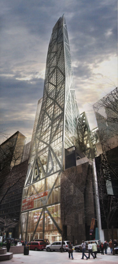
Jean Nouvel’s proposed MoMA tower
This principle is what City Planning Chair Amanda Burden may have had in mind during last month’s public hearing when she said of Jean Nouvel’s MoMA Tower design, “How this building meets the sky is not only in the tradition of great New York City architecture, but it’s absolutely essential that it culminate in a very sophisticated and distinguished apex.” Her enthusiasm for a design that exceeds its allowed zoning height testifies to its appeal. Speaking in the hearing, Nouvel said of his tower that “It has to disappear into the sky”. It will do this by tapering to a point as viewed from east or west, and by becoming translucent when viewed from the north or south. This light-permeable aspect may be what earns this building – one of countless glass skyscrapers, after all – the name “Tower Verre”.
Tower Verre would rise above its context.
When the design’s flatter-topped aspect was questioned during the hearing, a photo-montage showing it in context was put forward in support of Nouvel’s case for his tower’s role as “the missing piece of the puzzle” in the ups and downs of the skyline as viewed from Central Park.
Amanda Burden appears to be betting that the building’s proposed height will enhance the kind of slender, sky-backed silhouette that graced prewar New York’s mythic skyline. As reported in The Architect’s Newspaper, she placed Nouvel’s design squarely in this context last week, saying “It must be iconic, it must be distinguished. To get to that height in the sky, it’s got to be great. I don’t have a problem with the height. But let’s see it, and see where it falls with the Chrysler Building and the Empire State Building and if it deserves it.”
Whether any building can recapture the magic of New York’s prewar icons in today’s crowded sky is questionable.

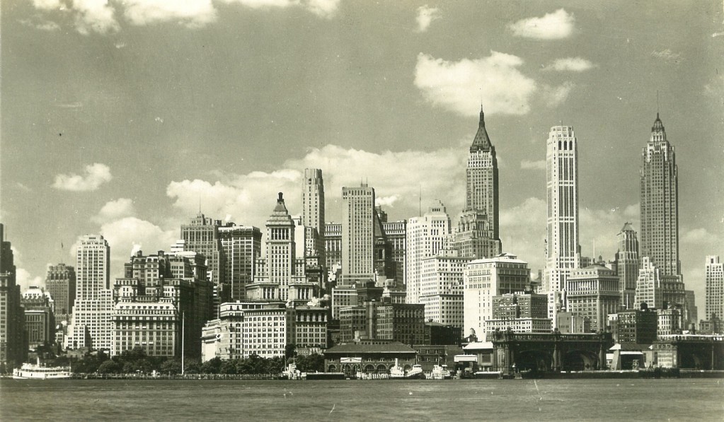
Lower Manhattan’s prewar skyline in a postcard view
Analyzing the shape of skylines, Rudolf Arnheim wrote that “A sharply horizontal boundary tends to produce an abrupt break between architecture and sky. This is not the case when we see irregular contours, which may build to peaking clusters. The diminishing width of spires and towers supports the same visual conception. The architecture diffuses gradually into the sky.” (The Dynamics of Architectural Form, University of California Press, 1977, p.26) The contours Arnheim describes belong to a lost New York, when slender, loosely spaced towers reached into an enveloping sky that interlaced with their soaring fingers. This is the New York of photos by Andreas Feininger and Samuel H. Gottscho, taken before broad boxes filled in the sky spaces, and created Arnheim’s “abrupt break between architecture and sky”.
Long before the Coen Brothers lyrically recreated the prewar skyline for their 1994 movie, The Hudsucker Proxy, David O. Selznick recorded it, still intact, in Portrait of Jenny, his 1948 movie about an artist who falls in love with a ghost from an earlier time. Making a theme of the sky’s supernatural associations, this film begins and ends with views of it and uses the Manhattan skyline throughout to make its presence palpable. The dated nature of the story takes nothing away from Portrait of Jennie’s achingly romantic lost skyline. The story in fact parallels the viewer’s seduction by the backdrop ghost city, as irretrievably lost as Jennie.

David O. Selznick’s spectral Jennie, played by Jennifer Jones, enters an early scene in “Portrait of Jennie”, delivered to earth by a sky reaching down between the Pierre and Sherry-Netherland Hotels.

Joseph Cotton’s garreted artist Eben Adams is haunted by Jennie, for whom the skyline becomes a leitmotif. Watching over his shoulder, we are haunted by the lost skyline itself.
What chance would Nouvel’s tower have of bringing a piece of this city back to life, assuming it’s approval effort succeeds? The 1,250 foot height that makes it such a lightning rod would increase its figure-ground interaction with the sky. The rest depends on the vitality of its design. A fake antique like 15 Central Park West would only emphasize our distance from the authentic prewar spirit. Nouvel’s challenge is to recapture the wonder-inspiring newness and strangeness that skyscrapers had so long ago. His design seems to borrow new life from popular undercurrents of skyscraper psychology. New York’s skyline has long influenced the cityscapes of fantasy drawings and science fiction movies. Nouvel is a film lover who has been said to interpret “cinema as the creator of today’s myths and icons“. His design for the MoMA tower may capture reflections from parallel fantasy worlds well beyond the Hugh Ferriss renderings that he presents as its inspiration. Tower Verre’s tapering expressionistic asymmetry and spidery frame have an eeriness evocative of other worlds that Selznick – or any member of today’s targeted 13-year old male movie demographic – would grasp and savor immediately. Prewar New York remains distinct because it was frozen for so long and followed by such different architecture. It’s this sharp definition that makes it such a compelling ghost and its lifeless replication such a trap. Whether Tower Verre succeeds, it is notable for attempting to reincarnate prewar New York’s true spirit in a new body.

A century ago, the cover of “Life” magazine’s 1909 Real Estate Number showed elongated caricatures of New York skyscrapers breaking through clouds into their own celestial realm.

The “Life” cover is echoed by the opening shot from Portrait of Jennie, which also provides the cover art for James Sanders’ book “Celluloid Skyline: New York and the Movies“, (Knopf, 2001).

A cartoon from the the 1909 Life real estate issue suggests a supernatural side of skyscrapers. Its caption reads, “The Heaven-Reaching Skyscraper: The Amalgamated Angel Labor Union of 1910 at Work”. Spiritual implications carried over to skyscrapers from church spires, formerly the tallest of structures.

Titled “Some Day”, this is another of the same “Life” issue’s several cartoons that feature fantasy airships communicating among skyscrapers. The zeppelin mooring mast at the top of the Empire State Building tethers skyscrapers’ advanced technology to fantasy. Fritz Lang’s 1927 Metropolis and countless films since have explored this overlapping territory. The prewar Manhattan skyline has had an afterlife in the visionary sets of films like Kerry Conran’s 2004 “Sky Captain and the World of Tomorrow” and Tim Burton’s 1989 “Batman” movie, for which Anton Furst’s Gotham City design “completely turned its back on postwar New York”, as noted by James Sanders in “Celluloid Skyline“.

The Empire State Building is prewar New York’s physical and temporal climax. For City Planning Chair Amanda Burden, it’s also the measure of Tower Verre.

