
“A Lake or River Villa for a Picturesque Site” illustrates A.J. Downing’s 1850 book, The Architecture of Country Houses. Its orderly cruciform plan of perfectly shaped rooms is undisturbed by the messy supporting business of kitchen, laundry and storage hidden out back. Unprepared for the encroachment of modern equipment, the villa’s designer simply tacks on a perfunctory service wing that drifts off the page while he focuses on the familiar building blocks of room and stair. Today’s house designer has even more services to integrate, with bathrooms, wrap-around kitchens, utility rooms and attached garages. He seems just as ill prepared to integrate these, and often puts up a dummy house-front of formal rooms to simplify composition of the street façade and to serve as an uninhabited buffer zone shielding the private family spaces and their services in back. As with Downing’s example, the rear face of today’s house is a secondary concern. The accidental backs to be glimpsed across rear yards of housing tracts attest to this. Modern house-plan fare visibly strains to juggle curb appeal, integrity of rooms, and integrated services. Downing’s example drops the ball on incorporation of services in favor of whole rooms and a picturesque face.

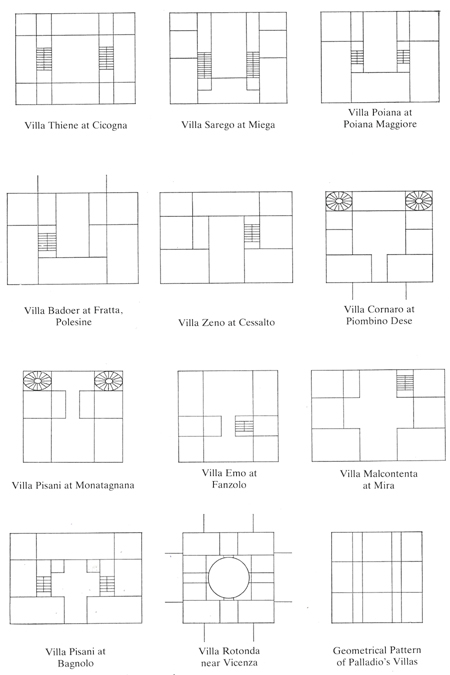
Rudolph Wittkower’s influential 1949 book, Architectural Principles in the Age of Humanism, is illustrated with “Schematized plans of eleven of Palladio’s Villas.” Wittkower identifies the grid pattern at lower right as the basis for all of these. By stretching its zones slightly and selectively omitting line segments, Palladio used this diagram to define all of a villa’s spaces at once. The simultaneity and comprehensiveness of this method allowed rooms of varying shapes, sizes and orientations to mesh perfectly within a simple container. The approach contrasts with that of the designer who plants rooms sequentially across a house, one decision limiting the next, and each additional room more awkwardly forced into whatever space remains. This hapless approach is evident in the gerrymandered outline of the combined living spaces in so many of today’s houses, shapes no one would ever intentionally set out to make but could only have backed into.

Wittkower’s pattern is here overlaid on Palladio’s Villa Foscari, “La Malcontenta,” of 1558-60. Working from this pattern, Palladio not only insured perfectly formed rooms that would fit together with the precision of puzzle pieces, but pre-loaded the building faces with a classical rhythm. As the walls were all load-bearing, the pattern also automatically gave his villas a workable system of structural bays. The vaulted ceiling at the center of La Malcontenta illustrates his method’s marriage of structure and form. The pattern’s “tartan” alternation of wide and narrow zones would be adopted by later architects to integrate modern services, as foreshadowed by its unintrusive accommodation of stairs in Palladio’s villas.

Frank Lloyd Wright’s 1894 Winslow House compactly internalizes services like kitchen and pantry (upper left), stairs, driveway entrance and storage without compromising the shape or organization of its living spaces.

Above, Palladio’s grid pattern is laid over the Winslow House plan, demonstrating its adaptability to the machine age. A geometric pattern allowed Wright to absorb services into a coherent plan. While most often recognized as history’s most influential architect for his classical vocabulary, Palladio’s way with order has extended his impact into modern architecture.

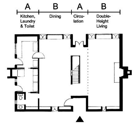
Louis Kahn’s 1959-61 Esherick House applies a simple abab rhythm of narrow (service) and wide (living) zones to a one-bedroom house for a single woman. Kahn was fascinated by Wittkower’s illustration of Palladio’s villa pattern, which contributed to his conception of buildings composed of served and servant spaces. He saw in the narrow bands of the tartan grid an opportunity to assimilate a building’s smaller support functions without disrupting its primary spaces or overall order. The Esherick House echos the wide-narrow-wide pattern of the traditional center-hall house but adds another narrow zone on one side, containing the modern service machinery of kitchen, toilet and laundry downstairs and the master bath and closets upstairs. This zone is effectively a closed but permeable “servant” block placed functionally between the driveway and the open “served” living space, the upper and lower levels of which are united by a double-height living room. Sliding partitions allow the single upstairs bedroom, above the dining room, to open onto the two-story living area, making the entire house except for the service block into a single uncomplicated space for Kahn to treat as a laboratory of natural lighting. The service block can be read as a thickened wall out of which the small support rooms have been carved, bookending the house with the nearly blank fireplace wall at its opposite end, each providing privacy from side neighbors. In its response to context, Kahn’s diagram not only results in an internally coherent house, but one which is optimized to its site.

The organization of the Esherick House is legible in its rear façade. From left to right are the double-height living room, stair hall, bedroom-over-dining room, and service block.
Rule 3 is to design from a diagram.

Design from a diagram. Begin with the spaces and functions the house must contain, and an analysis of its site. Rather than starting with individual rooms, think in terms of a few ordered zones of spaces related by size and function, and array them to exploit the site characteristics and serve an overriding design direction. A comprehensive diagram for a small house can be very simple, but will yield a purposeful design made up of simultaneously conceived spaces that are all deliberate and whole. The resulting clarity of plan will not only be economical to build, but will minimize the material and psychological clutter that a house can place between its dwellers and their simple enjoyment of life.