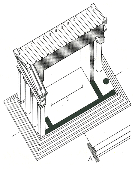
A cutaway drawing of the Temple of Diana Propylaea at Eleusis illustrates Auguste Choisy’s 1899 Histoire de L’Architecture. From tepees to temples to iconic mid-century glass houses, one-room buildings derive a primitive power from their simple integration of interior and exterior.
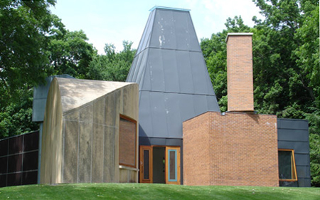
Frank Gehry’s Winton Guest House of 1983-86 is a maximalist response to the call of the one-room building, with each of its several rooms a building unto itself. Gehry said of his work from the period, “I thought that by minimizing the issue of function, by creating one-room buildings, we could resolve the most difficult problems in architecture. Think of the power of one-room buildings and the fact that historically, the best buildings ever built are one-room buildings.” Gehry’s approach exceeds the budget of the typical American family, but his appreciation of one-room power is universally applicable. For those who would tap into it, there are minimalist prototypes that suggest how to put multiple functions into what feels like a one-room house.

The plan of Mies van der Rohe’s Farnsworth House of 1945-51 is shown above that of Philip Johnson’s Glass House of 1945-49. Johnson said: “The idea of a glass house comes from Mies van der Rohe. Mies had mentioned to me as early as 1945 how easy it would be to to build a house entirely of large sheets of glass. . . . I pointed out to him that it was impossible because you had to have rooms, and that meant solid walls up against the glass, which ruined the whole point; Mies said, ‘I think it can be done’.” Mies’s solution was to eliminate partitions and create a one-room house. In doing so, he didn’t just find a way to make a pristine enclosure, but satisfied an inherited human impulse. Arthur Drexler referred to this when he wrote that “Mies’ most original buildings are one-story structures, and the greatest of these consist of one room. In this sense Mies has designed nothing but temples, which is to say that he has revealed the irrational mainspring of our technological culture.” It’s no wonder that when Philip Johnson followed Mies’s lead, he found the requisite unpartitioned interior “less a defect than a boon,” according to his biographer, Franz Schulze. Both houses in fact have more than one room, but disguise service spaces as freestanding objects. The success of this strategy proves that there are effective ways to give a house of multiple spaces the sense of one room.

A floor plan of Comlongon Castle, a 15th century Scottish tower house, shows subsidiary rooms and a stair contained within the thick walls of a single central room. The main room is so dominant, clearly defined and undisturbed by its surrounding support spaces that the castle retains the sense of a one room building. Louis I. Kahn saw in it a way to provide services without compromising the integrity of primary spaces. He wrote: “The Scottish Castle. Thick, thick walls. Little openings to the enemy. Splayed inwardly to the occupant. A place to read, a place to sew. . . . Places for the bed, for the stair. . . . Sunlight. Fairy tale.” This inspiration is most literally applied in the thickened wall that contains services in his Esherick House, illustrated in Rule 3.
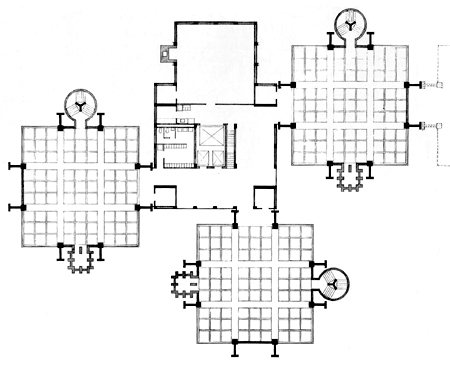
An early version floor plan of Kahn’s 1957-61 Richards Medical Center at the University of Pennsylvania shows three square laboratory spaces clustered around a central service core. Like the central room at Comlongon Castle, each laboratory is a pure shape surrounded by support functions – stair, ventilation shaft and columns – clearly illustrating Kahn’s idea of an architecture of served and servant spaces. As at the castle, these would be stacked into towers.

A sketch of Alison and Peter Smithson’s 1959 “Retirement House” project for Alison’s parents owes a clear debt to the Richards Medical Research building by Kahn. Here the surrounding “servant” appendages are bathroom, kitchen and storage and the central “served” space is a one-room house.
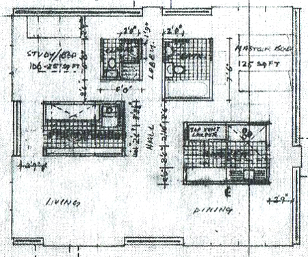
A more developed plan of the Smithson’s Retirement House turns the earlier version inside out, bringing Kahn’s servant spaces indoors as multiple offspring of the Farnsworth House core. These are held away from the exterior walls, even though a glass perimeter isn’t at issue here. The inviolate perimeter does, however, create much the same one-room effect as the Farnsworth House, with a simple shell enclosing a single flowing space. A sense of freedom and endlessness is produced by the absence of dead ends or space-trapping corners; even the necessary inside angles of the outer box are each glazed on one side, suggesting continuation of interior space to the exterior, and flooding what would otherwise be dark corners with light. The loose arrangement of the service cores creates separate areas for different functions which flow into each other, rather than the usual bento box of contained rooms.
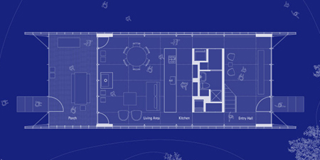
Benthem Crouwel’s Benthem House is a high-tech, lightweight update on the one-room house. Its services occupy a thickened wall in the manner of Kahn. The strip of cabana-like rooms at right contains kitchen, bath, mechanical equipment and two small bedrooms. What the house gives up in the 360 degree outlook of its Farnsworth House ancestor, it makes up in livability. The opaque service bar of such a solution might also provide privacy on a less remote and more affordable site than the Farnsworth House’s.
Thomas Phifer’s Salt Point House, completed in 2007, has an island service core on its first floor that creates privacy between its entry area, at right, and living area, at left. The plan adopts the Farnsworth House’s model of a single room with a freestanding core, but affords privacy in a way that might be useful to any house on a narrow lot.

Pierre Koenig’s Bailey House of 1958-60, also known as Case Study House #21, uses both island-core and thickened-wall strategies. The upper rectangle shows the house’s enclosed envelope, framed by opaque walls on each side and encircled by a moat that is occasionally bridged by brick-paved patios. The living space is at left. Its gridded floor encircles a core of two bathrooms flanking a tiny open-roofed court. This claims the space all around the core as part of the living area, extending its domain right up to the bedroom and offiice at the extreme right. These are defined not by partitions but only a change in flooring, and might be read as part of a thickened wall even though they are spatially open to the gridded floor associated with the living area. They can be sealed off from each other by sliding doors, and from the living functions by pocket doors on either end of the bathroom core, aligned with the house’s centerline. Closing these can convert the entire right half of the house into a thickened wall containing private support spaces. With this design, Koenig takes Mies’s ideal of the one-room house into impressively practical territory. By day, with its sliding doors open, the house can feel nearly as open as the Farnsworth House, all its spaces contributing to a building-sized expanse. What might be constrained corridors in another architect’s hands here contribute to the house’s open area. By night, its more private spaces have the option of being closed off. The house was designed for a childless couple but might serve a small family as well, thanks to its easy flexibility. The study is immediately convertible to a bedroom but meanwhile has a welcome openness not usually found in a spare bedroom. The Bailey House is an open and flexible model particularly well scaled to the typical American family of today.
House Rule 4 is to pursue a one-room ideal.
![]()
Pursue the clarity and simplicity of a one-room house. Give priority to a single continuous interior space, and treat services that must be enclosed, like bathrooms, closets and utility rooms, either as islands within this space or as part of thickened exterior walls enclosing it. Minimize dead ends, interior corners and containment in favor of a sense of uninterrupted space.

It is important to note that the idea of the singular space in Mies’s buildings is that what he called the universal space is intended to be entirely flexible. The idea that a column free space can accommodate any future changes of use is in reality largely symbolic, expressive of a longing to be free of constraints. Even his core designs seem to be impermanent, often mostly free of the ceiling.
The single space idea has limitations even Mies recognized. The Farnsworth House was designed as a weekend nature retreat for a single woman and worked well for that. Mies experimented with a similar universal space for a family house in his 50 ft x 50 ft unbuilt concept house, but abandoned the idea.
In his larger buildings, he always had a substantial amount of area, above or below, configured as traditional enclosed rooms, while the universal space remained primarily as a symbol representing the idea of freedom, a space suggesting the opportunity for the “free unfolding of life”. It served the same spiritual purpose as the central rotunda of classical buildings, but its modern space was opened to the exterior through glass walls.
Johnson’s Glass House is integrally paired with an adjacent brick house, where a private study, luxurious bath and cozy bedroom are located, as well as HVAC equipment for both it and the Glass House.