Johannes Vermeer’s The Music Lesson was painted in the early 1660s. As in most of Vermeer’s thirty-odd paintings, light enters from the left, spreading itself across a rear wall. The situation is modeled on his studio, where a window and wall intersected to create just such a wash of illumination. While light can be visibly suspended in the thick air of haze or smoke, it typically manifests itself on the surfaces it strikes. Vermeer portrayed this presence so strongly that light is said to be a character in his paintings.

Edward Hopper painted Rooms by the Sea in 1951. Recalling Vermeer in both light and convenience of inspiration, the scene is based on the artist’s studio. Hopper’s light takes on added mystery in its juxtaposition to a surrealistically immediate sea. An alternate title, The Jumping Off Place, was abandoned because of its perceived “malign overtones.” This title would have emphasized the interior-exterior dynamic that distinguishes Hopper’s painting from a Vermeer. With its minimal frame, the opening to the sea is less like a hole in a wall than the mouth of a chute, implying outward projection and stating the spatial complement to the lighting effect of Vermeer’s window. Painters’ sensitivity to light allows them to recognize its transforming effect wherever they find it. Some architects share this sensitivity and have created powerful examples of what can be achieved with light’s deliberate staging.

A tiny window admits disproportionate light in Jorn Utzon’s house, Can Lis. (See Rule 6.) The oblique incidence of sunlight here highlights the texture of stone quarried on-site, reinforcing the relationship of the house to its immediate setting. The moving shaft of light acts as a sundial, engaging the greater context of the solar system.

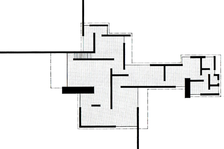
The 1924 plan of a Brick Country House by Mies van der Rohe is often compared to an abstract De Stijl painting. Radical for its time, the plan replaces traditional box-like rooms with flowing space. Walls project out into the landscape, suggesting the further flow of interior space into the outdoors. With only two exceptions, exterior corners are formed by a brick wall intersecting glass, thus recalling Vermeer’s window. These corners would at once recreate his characteristic wash of light and invite the eye of the occupant to follow the opaque walls’ real (in some cases) or imagined projection into exterior space. The house would not only have admitted light like no other of its time, but would have created an unprecedented sense of spatial release.

Frank Lloyd Wright’s 1924 Freeman House dates from the same year as Mies’s Brick Country House. Extending from floor to ceiling, Wright’s glazed corners look less like conventional punched windows than gaps in exterior walls. Interior space slides between the floor and ceiling planes and outside without interruption. Wright rebelled against Palladio’s assertion that corners should not be opened because they are a building’s strongest support. He wrote in his Autobiography: “I soon realized that the corners of the box were not the economical or vital bearing points of structure. The main load of the usual building I saw was on the walls and so best supported at points some distance back from the corner. The spans were then reduced by cantileverage. So I took the corners out, put in glass instead . . .” Wright turned what had been the darkest part of a house into the brightest. He also struck one of his greatest blows against the tyranny of The Box, and shelter’s ancient baggage of confinement.

Louis I. Kahn used a keyhole window of his own invention in the design of the 1959-61 Esherick House. (See Rule 3.) While respecting privacy, the street-facing window allows a maximum of natural light to enter at the top of a double-height living room, insuring that it will fall deep into the house. Kahn placed its frame tight against the ceiling and walls, exploiting them in the manner of Vermeer and using their light-washed surfaces to soften the contrast between bright outdoors and shaded interior. The narrow windows below, reminiscent of castle architecture that captivated Kahn, have shutters that can be closed for greater privacy. Built-in shelves on either side make a sun-shielded place for books and a deep window recess. Kahn reduced contrast and glare by fully glazing the more private opposite side of the space, balancing natural light throughout.

Kahn’s 1959-69 First Unitarian Church in Rochester, NY, rebukes the entire history of stained glass. Four center-facing light scoops rise from the corners of its sanctuary, cardinal point apertures that track the sun’s transit and lock the space into a celestial context. Raw, glare-free light is captured on the humblest concrete surfaces. The stark lack of artifice distills light to its essence, allowing it to manifest itself to the viewer as if for the first time and re-ignite wonder. The space is a reminder that other worlds are no competition for the forgotten mystery of immediate reality, once distractions are removed and our attention is brought back to it.
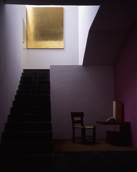
Luis Barragan’s 1947 House and Studio uses light not just for illumination, but to modulate space with brightness, shadow, attraction and mood. For the devoutly Catholic Barragan, light clearly had a spiritual dimension as well.
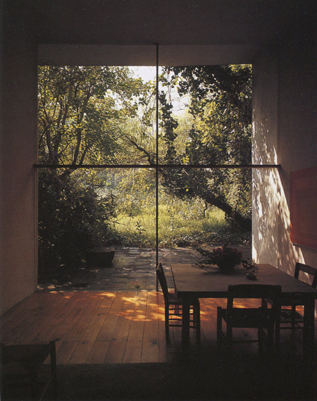
The main living space in Barragan’s house has a framelessly glazed end wall. The eye is led smoothly into the landscape even as leaf-dappled light washes over interior surfaces, bringing trees and their wind stirred movement indoors. (See Rule 8.)

Tadao Ando’s 2001-03 4×4 House, a tower by the sea, showcases two basic window types. The small one above the table classically frames a view within an opaque plane. As is typical with such punched openings, the eye’s tendency to restore the wall plane’s unpunctured gestalt competes with whatever sense of spatial flow into the distance might be suggested by the window. The constrained visual dynamic is the opposite of Barragan’s frameless window pictured above. Ando’s placement of a TV screen next to the small window seems a wry commentary on its spatial superficiality. The frameless glass wall at right presents no such hurdle. Its “jumping off” sense of outward extension and dramatic wash of sunlight recall Hopper’s Rooms By the Sea. The small window serves as its counterpoint, but also provides orientation and integrates the house with the dining table, to which it is aligned and scaled. (See Rule 6.)
Rule 7 is to optimize natural light.

Make the most of natural light. Provide large windows at living areas and economically supplement these with strategically placed smaller windows to balance interior light. Place windows at corners to allow light to splay across adjacent surfaces and to break the corners’ sense of confinement. Use tall windows to allow light to fall deep into interior spaces. Conceive of the house as a means of modulating natural light and choreographing the sun’s movement.

