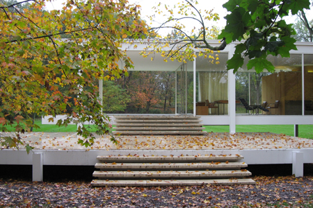
While not the first great modern house, Mies van der Rohe’s Farnsworth House is without doubt the most influential today. It embodies two especially pertinent ideas that support flexibility. Its standardized industrial components suggest a demountable and reusable kit-of-parts architecture which, sixty years since, is the concept behind today’s explosive proliferation of prefabricated modular and recyclable housing solutions. The Farnsworth House is spatially adaptable as well. Its open plan reflects Mies’s ideal of timeless “universal space,” the usefulness of which might outlive ephemeral functional assignments. From the wheelchair of his later years, Mies would have appreciated a further merit of this open plan; its lack of physical barriers. Such a house has the potential to remain useful to an occupant whose own physical condition changes. Mies raised the Farnsworth House several feet off the ground to protect it from the flooding of an adjacent river, abandoning an on-grade alternative scheme might have made it truly accessible.

Admittedly derived from the Farnsworth House, Philip Johnson’s Glass House realizes the ground-resting condition of Mies’s abandoned scheme. Now open to the public, the Glass House is readily made accessible to wheelchair users by way of the barely noticeable ramp shown in the photo above. Its open interior is likewise wheelchair-friendly.

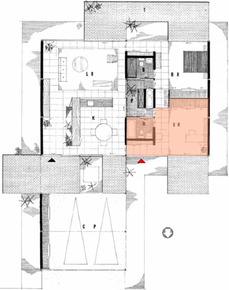
#21 in the canonical Case Study House series of model homes for post-war America, Pierre Koenig’s 1958-60 Bailey House has a continuous circulation loop and system of pocket doors allow the entire house to be thrown open as a single bright space, giving the bedrooms a spatial vitality far surpassing their typical status as corridor-leg appendages. As noted in Rule 4’s discussion of the house, this contributes to a one-room feel in the spirit of the Farnsworth House, but with greater practicality and privacy potential. Koenig’s house has a pair of bed-and-bath suites, shown at right in the plan above. Although mirror images of each other and both labeled “BR,” one is shown furnished as a study. Photos of the house taken over the years show that it has served both uses. The rooms contribute to the house’s overall expansiveness even as their own openness and quality of space is elevated. Shaded in pink, the room shown as a study and its bathroom can be isolated from the rest of the house by pocket doors at either end of its grid-floored corridor segment. This area could be adapted to a private home office suitable for business visitors with the addition of an exterior door at the red arrow. While the house has only two bedrooms, it’s sized to the typical American household of today, which consists of an individual or couple. Beyond the outsized spatial appeal Koenig leverages out of its modest size, the Bailey House’s ready flexibility gives it an added dimension and a far greater resale appeal than the third or fourth bedrooms most Americans feel compelled to build with an eye toward the next buyer, and then pay to heat, cool and amortize while they stand empty for years. The Bailey House’s single level, openness and looping circulation path all make it adaptable in a way few American houses are; it could be a supportive home to a wheelchair user.

Renzo Piano’s expansion of the Morgan Library was completed in 2006. Wheelchair users enter it without the stigma of segregation onto a diverging ramp, alongside companions on foot by means of the same sloped surface and separated only by an assisting rail. In the manner of their day, the architects of the original Morgan buildings physically and metaphorically elevated their main floors and created a sense of transition from the everyday sidewalk with gracious but discriminatory stairs. While it’s still common for new entrance designs to provide a central stair and side-ramp, Piano’s resourcefulness serves the dignity of his building and all its users at once, with arresting simplicity. The new Morgan entrance approaches the aim of Universal Design, “the design of products and environments to be usable by all people.” An emerging and more integrated approach to “handicapped accessibility,” Universal Design is especially pertinent to housing; it would not only allow American baby-boomers to age in place, but would make for a home that those with disabilities can visit or consider buying. Retrofitting a house to be accessible is expensive, but building a new house that’s accessible costs very little more than building one that’s not. The open spatial quality that makes a house accessible has entirely separate merits, compatible with several of the other House Rules.

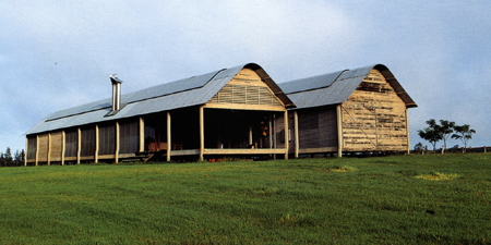
Glenn Murcutt’s Marie Short House was built in 1974-75 and later bought and enlarged by the architect, in 1981-82. Murcutt often cites the Aboriginal proverb, “Touch this earth lightly,” words taken by architectural historian Philip Drew as the title of his 1999 book on the architect. In it, Murcutt says of his design for the Marie Short House, “It was very important that the house could be modified and undergo major surgery and still retain its integrity. I came along, some years later . . . and altered it. . . . What was so exciting to me was that I was able to re-use the original veranda, the galvanized iron roof, every piece of it, including the louvre frame, gable end – the entire end came out and was unbolted. . . . If I wanted to, I could unbolt half the house and trundle it off into the forest and modify it minimally and have a complete house. I can put them together, pull them apart, change them, and they will retain an integrity, wherever I place them.” They’ll also retain vitality, thanks to their ability to respond to new demands. By contrast, the house that’s built for the ages is a monument to a moment, but necessarily loses vitality with time. Detroit and other rust-belt cities are reminders that not just houses but entire neighborhoods outlive their usefulness. A house that’s designed for recycling, if not re-use, acknowledges the transience of human life. A house that’s designed for permanence flatters the owner’s ego to his face while mocking his mortality behind his back. Murcutt is deeply influenced by Thoreau, who built his cabin at Walden Pond with “Refuse shingles . . . second-hand windows” and “one thousand old brick,” demonstrating the affordability of a house built “for a lifetime,” and by implication, no more. As he wrote in Walden: “Most of the stone a nation hammers goes toward its tomb only.” Murcutt seems to elaborate in Touch This Earth Lightly: “We are part of this whole – we are not the whole. Our being here is really the most transitory aspect of the planet. It is trees, it is climate, it is the earth, the water, the rocks and the landscape which is real. When we fail to see ourselves belonging to and as a part of that we become unreal.”


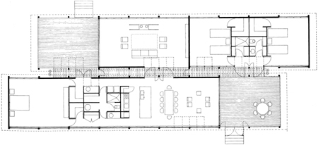
The plan of Glenn Murcutt’s Marie Short House in its original form, top, and as enlarged, bottom. The design lent itself to expansion in the re-usability of its components and in its extrudable form and longitudinal circulation axes. Mies’s linear, modular Farnsworth House is an influence Murcutt has acknowledged.

Werner Sobek’s glass houses, R128 was completed in 2000, in Stuttgart, Germany. Sobek holds the Mies van der Rohe visiting professorship at Illinois Institute of Technology, where Mies was for many years head of the architecture school. Sobek’s houses can be seen as an effort to render Mies’s vision environmentally responsible. R128 is entirely energy self-sufficient. It uses triple glazing, geothermal heating and cooling, and horizontal rooftop solar panels to dispense with fossil fuels and emissions altogether. Flexibility is a further sustainable aspect of its design. Sobek’s conviction that “it is unethical to throw things away” is reflected in his buildings’ construction from modular elements that can be detached and re-used elsewhere, realizing the recyclability that the Farnsworth house only suggested. Its three-dimensional steel grid has easily removed floor, wall and roof panels that might be reconfigured into a new house.
Rule 9 is to build for flexibility.

Design for change. Provide areas of different spatial qualities and levels of intimacy or privacy that might serve a variety of purposes, not rooms dedicated to single or fixed roles. Save space by designing areas to serve more than one function. Place critical spaces on the first floor or make the entire house one-story for ease of access to people of different degrees of mobility, and to allow residents to age in place. If more space might eventually be needed, place the house on its site to leave room for an addition, give it a shape that’s easily extended, and design circulation and services to support growth. Anticipate the end of the house’s usefulness, and design for easy disassembly and recycling.